Disclaimer
This project highlights my visual and interaction design skills. For a product thinking case study, refer to my “BR Operations” project.
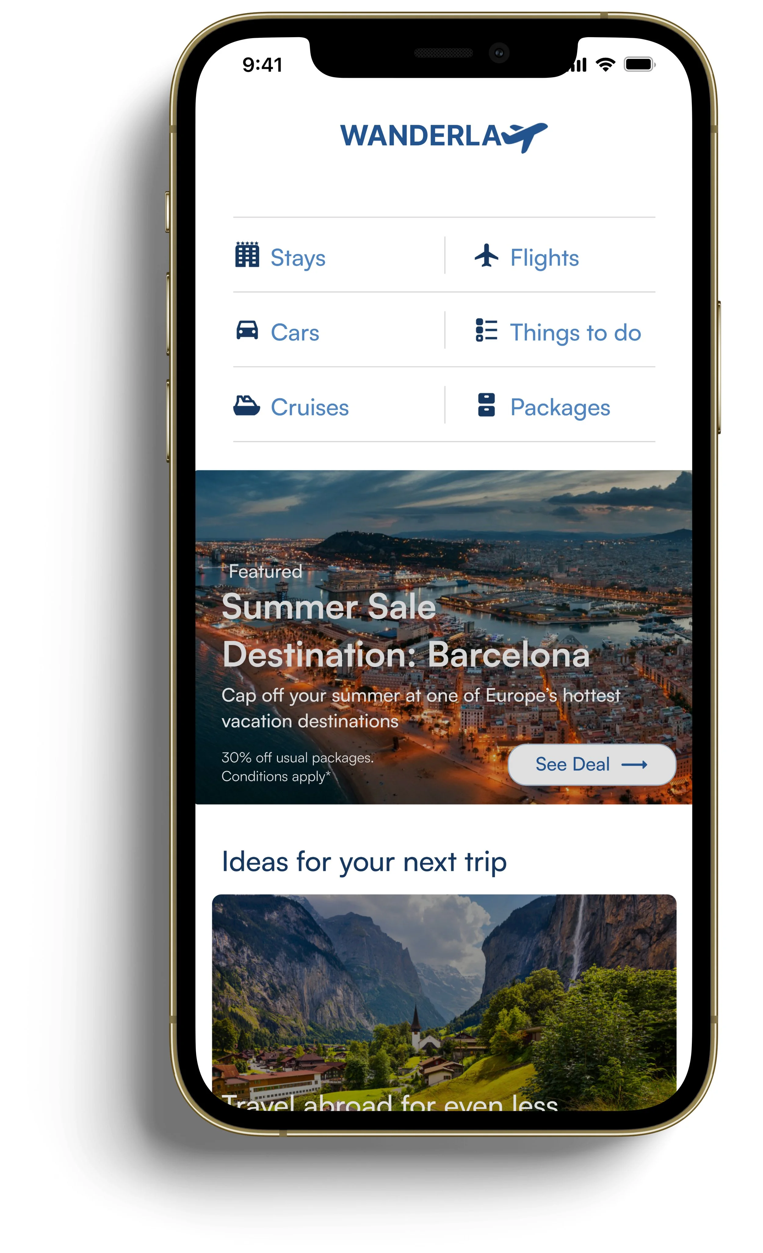
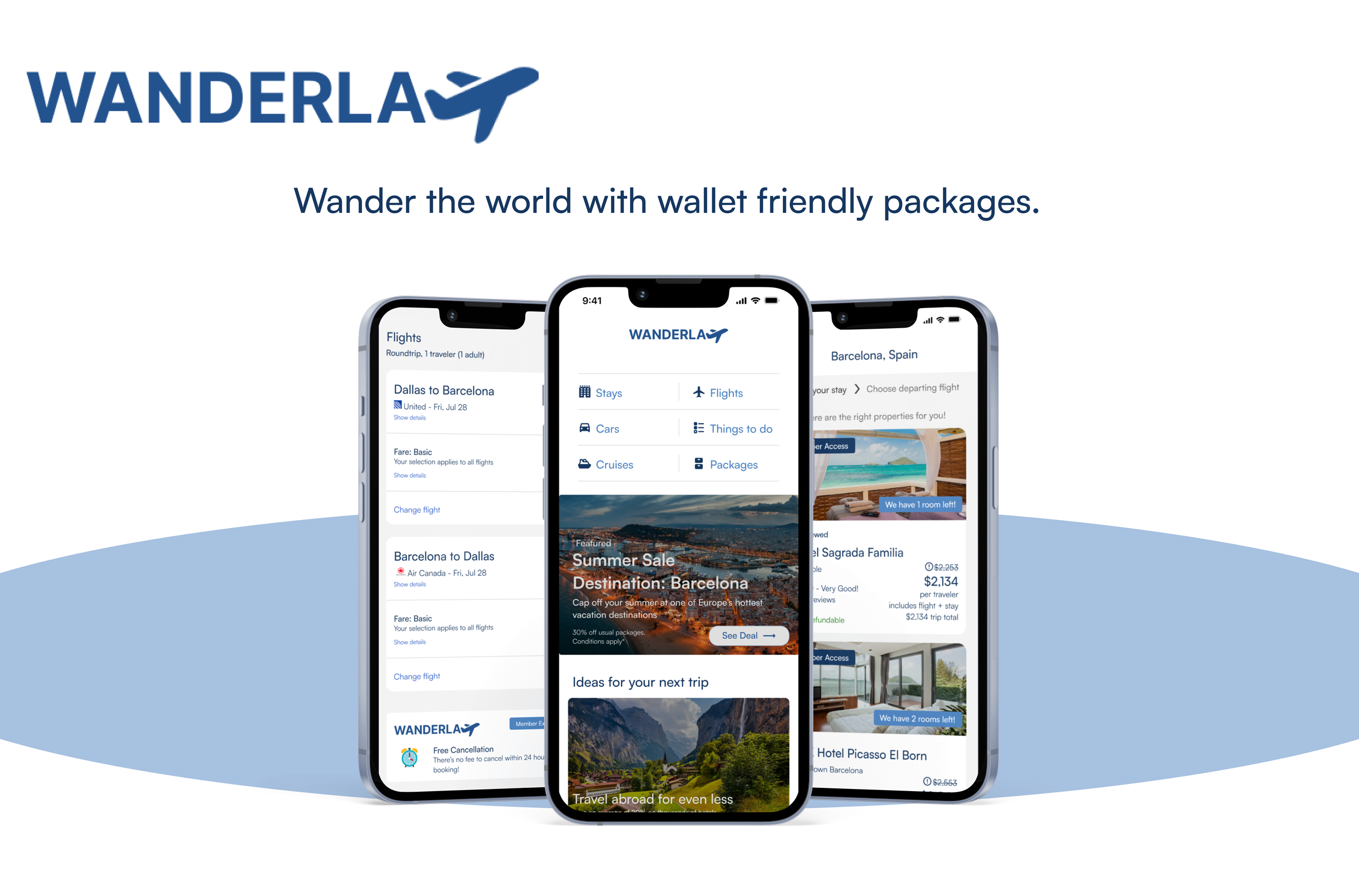
Project Background: This travel booking app flow was inspired by the simplicity of the Expedia app, and the budget friendly package deals of the Hopper app.
Wander around the world, on a budget!
1. Research
Research was done utilizing surveys, recruiting participants through Loop11. Distilled was the following insight.
Insight: A lack of direction for the user in the current travel consumer market space
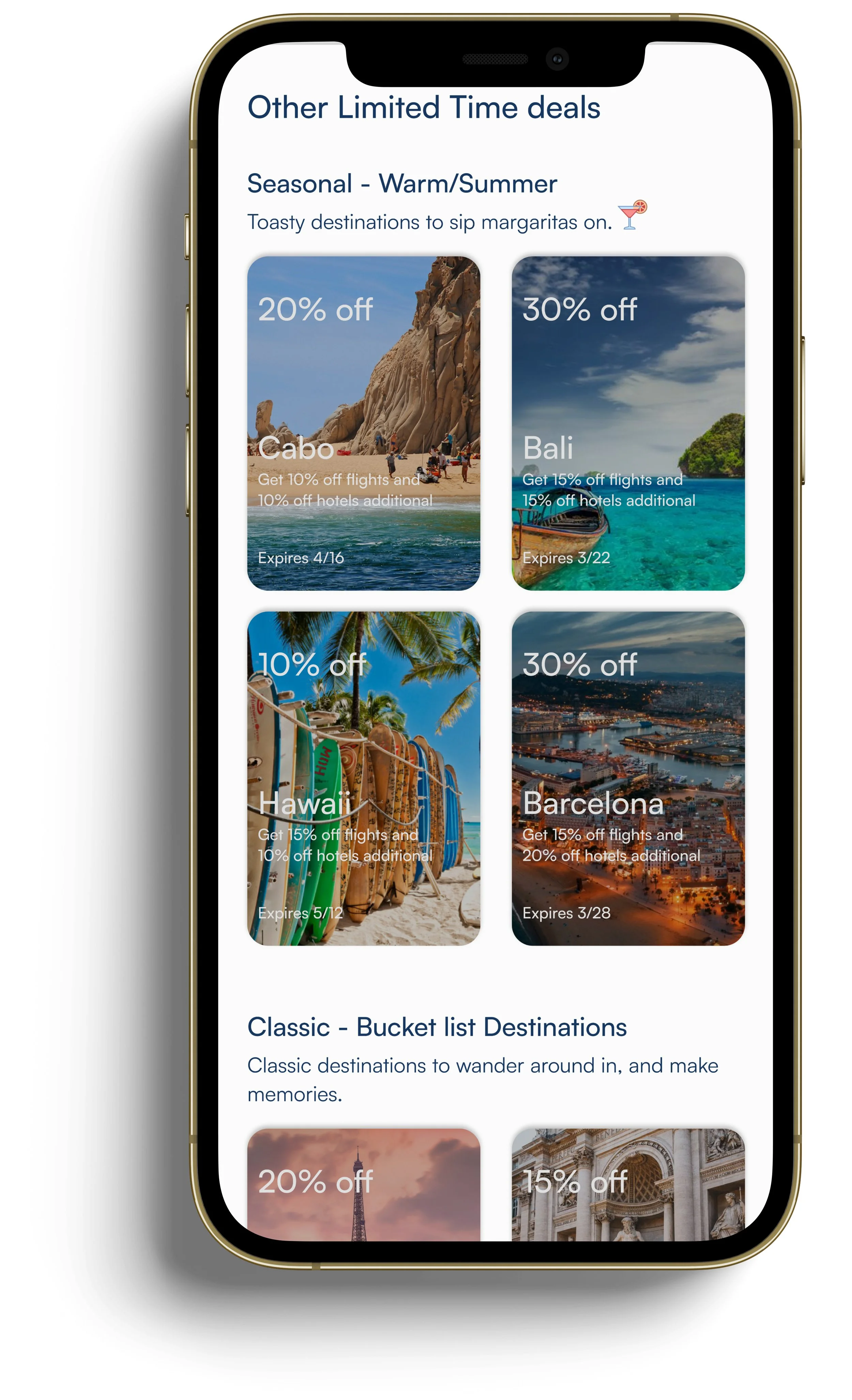
Most users do not have a specific travel destination in mind. They just wanna get away from their routine hectic lives. Users also feel the current market apps within the travel space lack a value proposition destination/ do not emphasize specific package deals - allowing users to explore many different sale destinations, which results in “Consumer Choice Paralysis” for the user.
This then ultimately results in the user to drop off in the process of booking a destination.
Challenge: Minimize “Consumer Choice Paralysis” for the user or. in UX terms “Cognitive Overload” for the user.
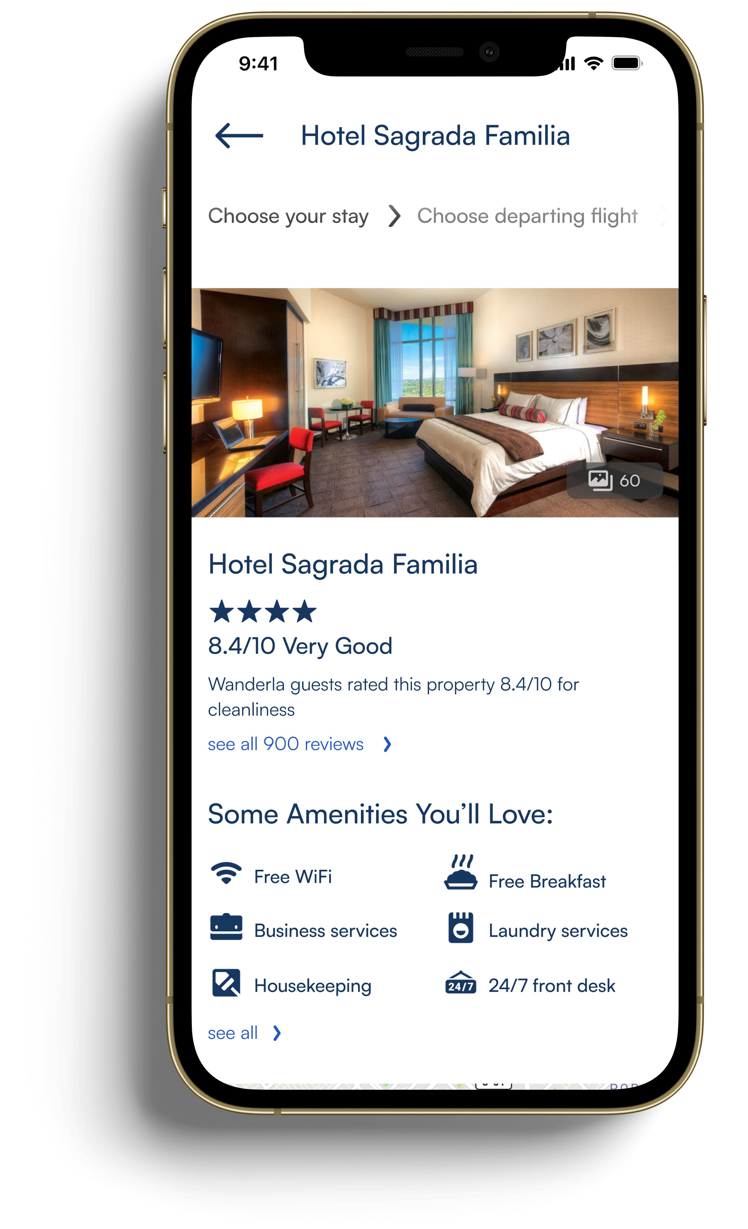
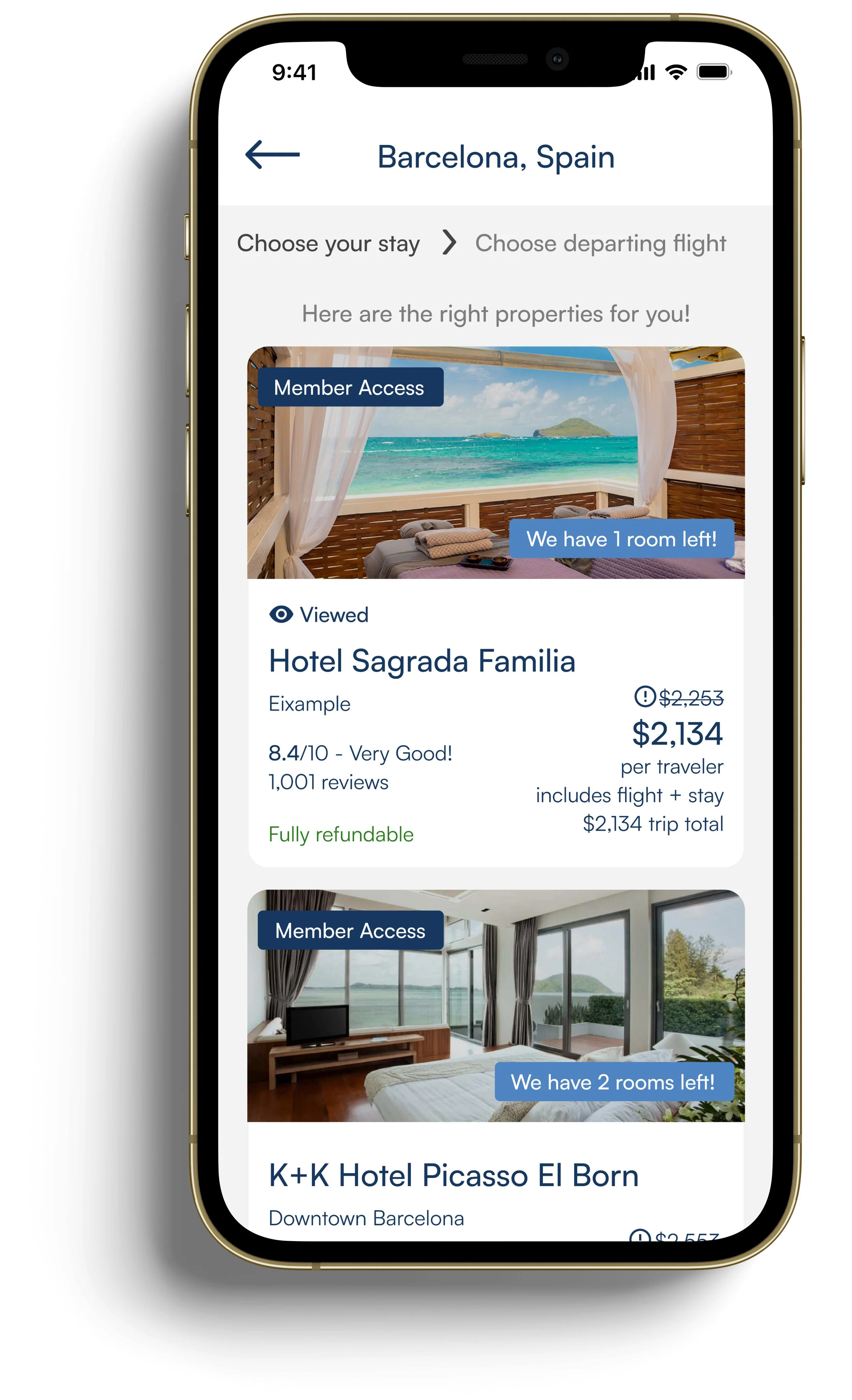
Solution: Give some sort of direction to the user/suggest the best possible value proposition to the user on the discover/home screen
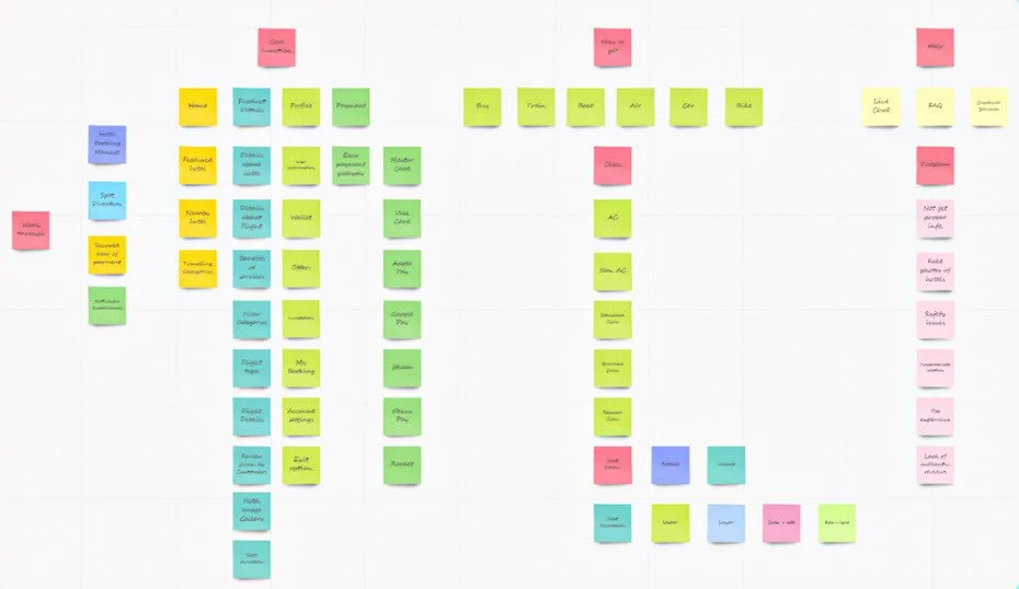
Card Sorting
Helped with giving me a robust direction for the structure of my solution.
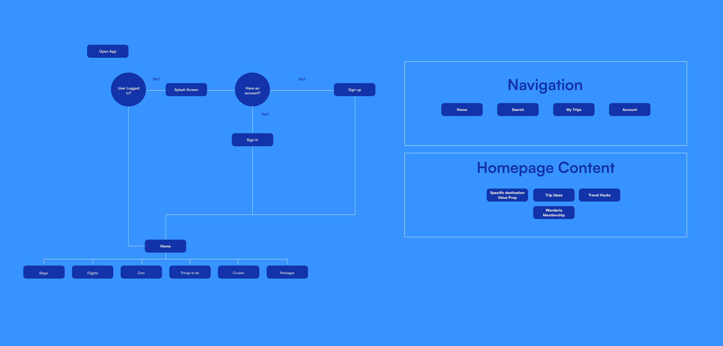
Flow diagrams
A map/visual representation of the design
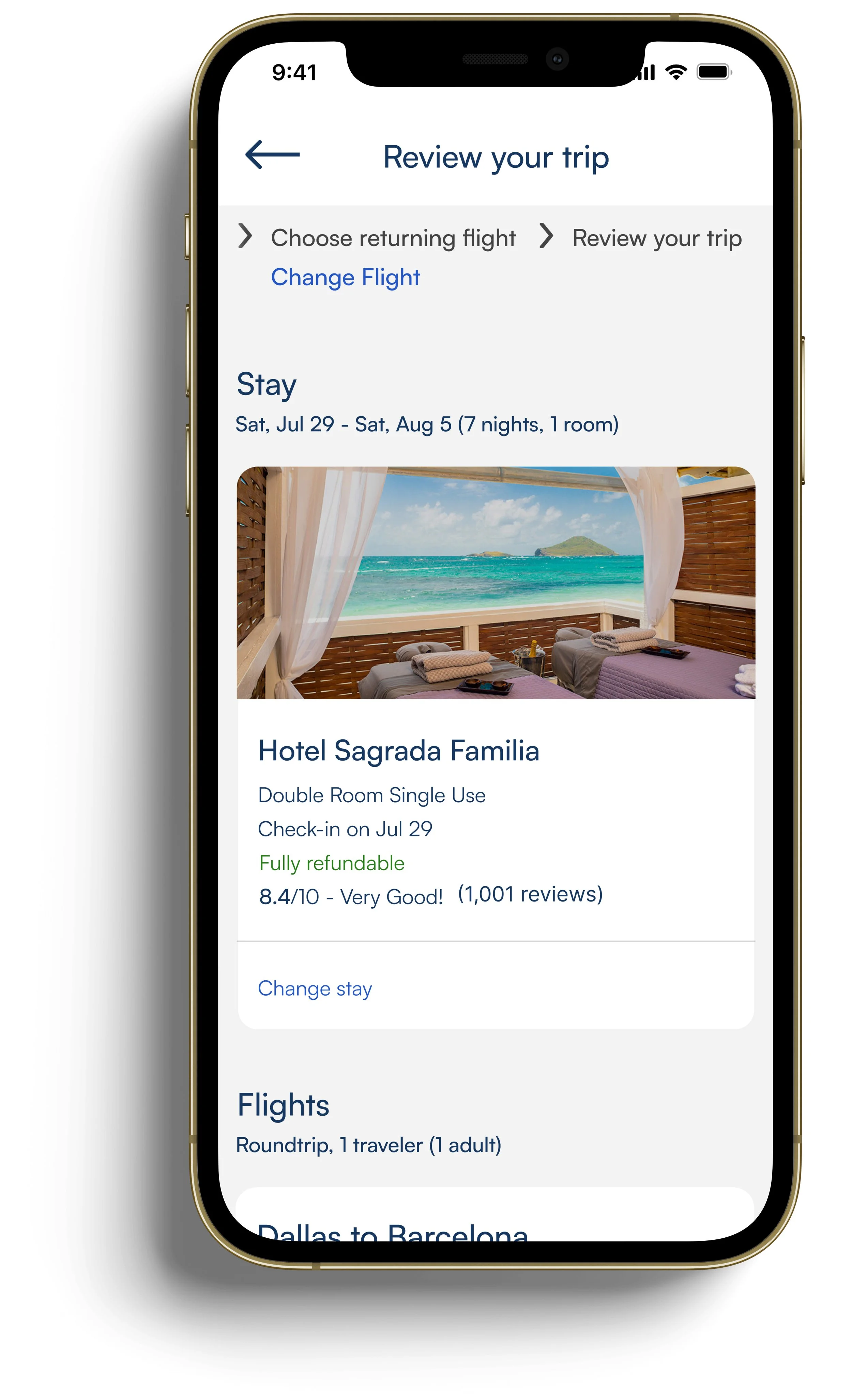
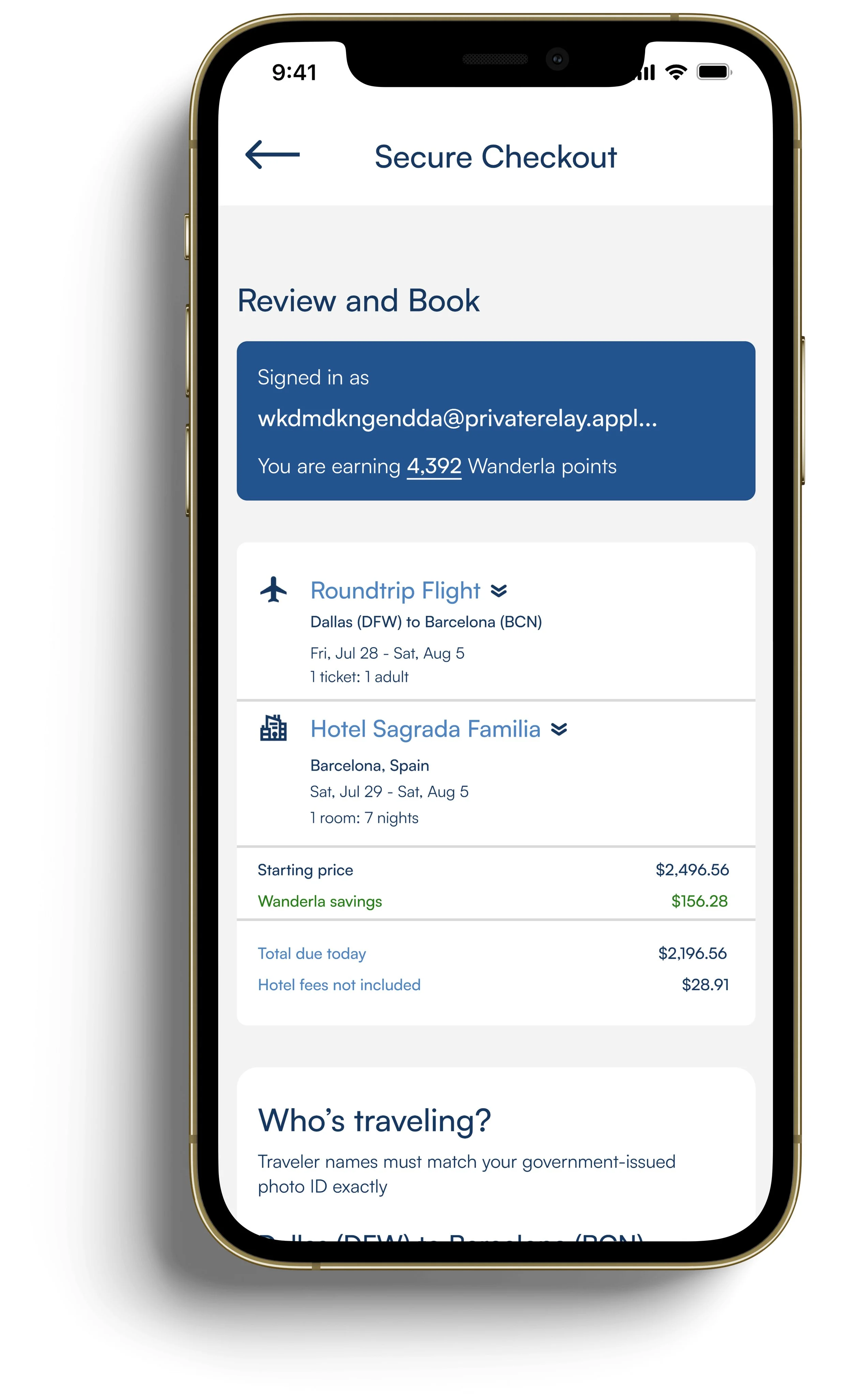
Final Screens