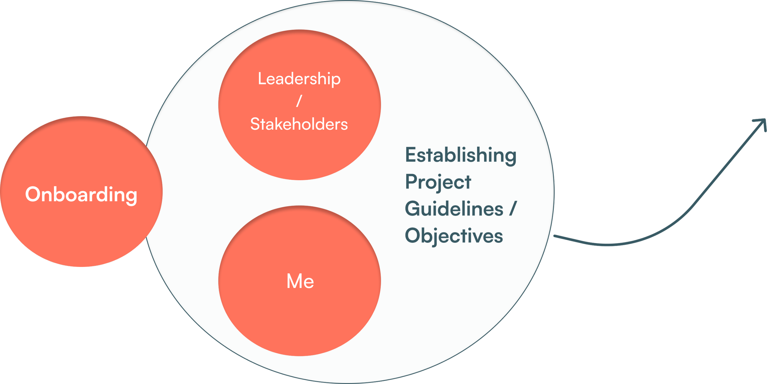
Context - I worked with LCB CORP based out of the UK that were expanding into the U.S with their new venture in the financial technology space. I was given a timeline constraint of 6 weeks, to design a complete functioning prototype for CASHit.

Project Outcome
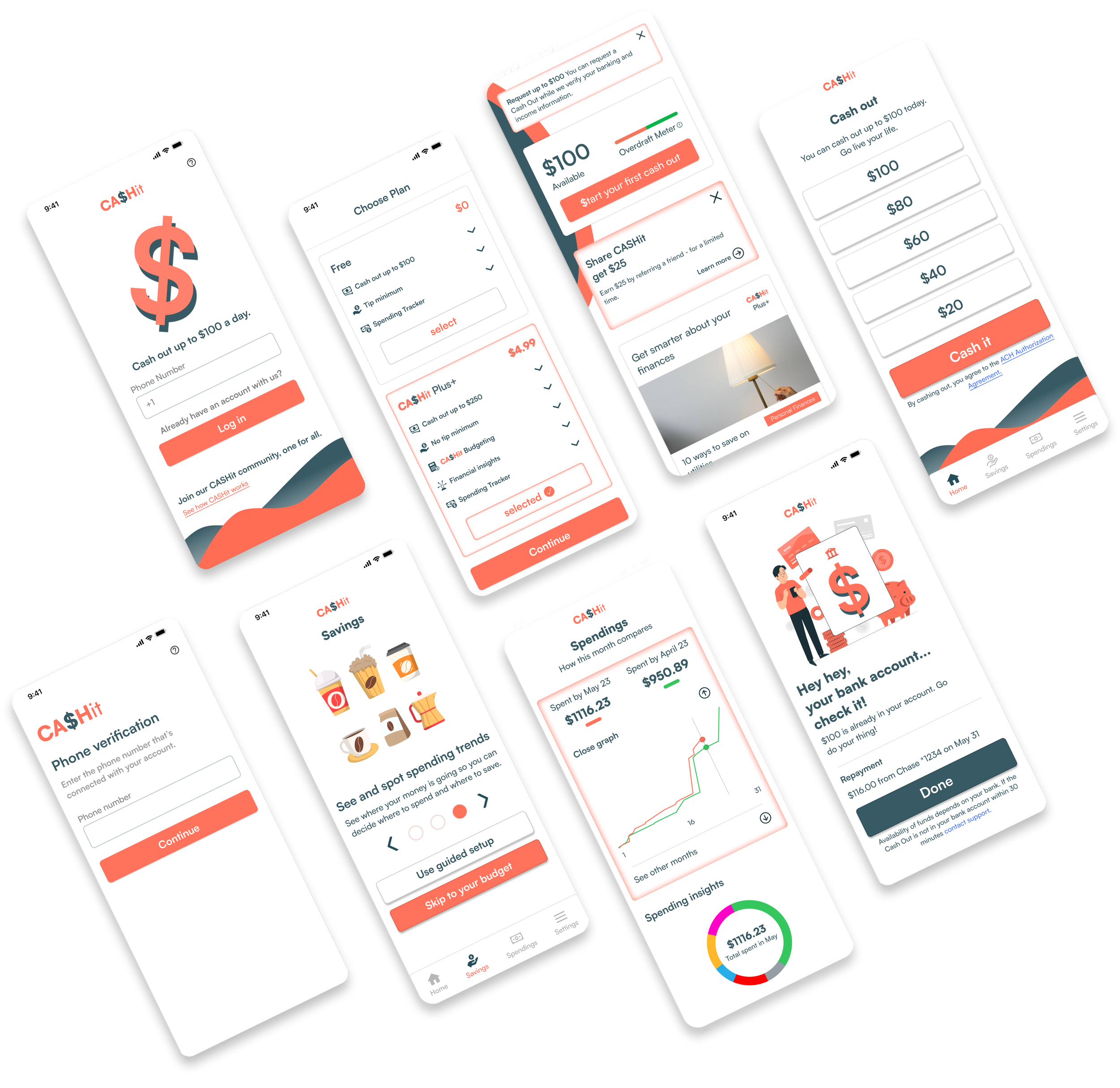
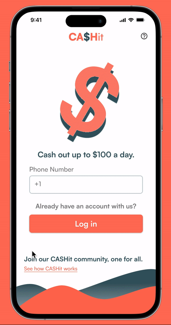
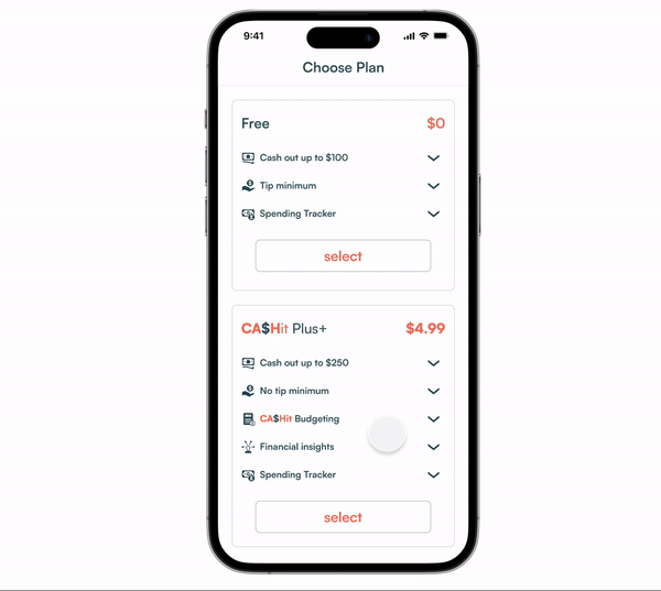
CASHit is an on-demand pay platform, where users can cash out up to $100 a day. CASHit also has a premium service “CASHit Plus+” for $4.99 a month which offers cashing out up to $250 a day, specialized budgeting features for its users, spend trend trackers, financial education insights, articles to empower & bolster user financial decision making.
Impact - Users
Impact - Business
Qualitative
• Users reported feeling less stressed about their financial situation.
• Users said they had a higher self esteem and felt more confident in their daily lives because of CASHit.
• Users noted a positive impact on their mental health.
Quantitative (via surrogate metrics)
• 100% of users avoided overdrafts within a 4 week period.
• 74% of our users were able to reprogram and get out of their financial entanglements (debt, paycheck to paycheck living) through the CASHit Plus+ premium subscription.

Qualitative / Quantitative
• 100% of business goals were accomplished.
• Showcasing my end design to potential investors led to a successful round of funding for my client.
Business objectives
The end goal of these objectives was to find a rough outline for our solution before my clients’ fund raising.
The Problem
Our users live paycheck to paycheck and get hit with (un)expected bills that lead to expensive overdrafts.
Business Goals -
1. User Adoption
2. Strong Value Proposition(s)
Product Strategy -
1. Accessibility
2. Convenience & Scalability
3. ??? - (my contribution)
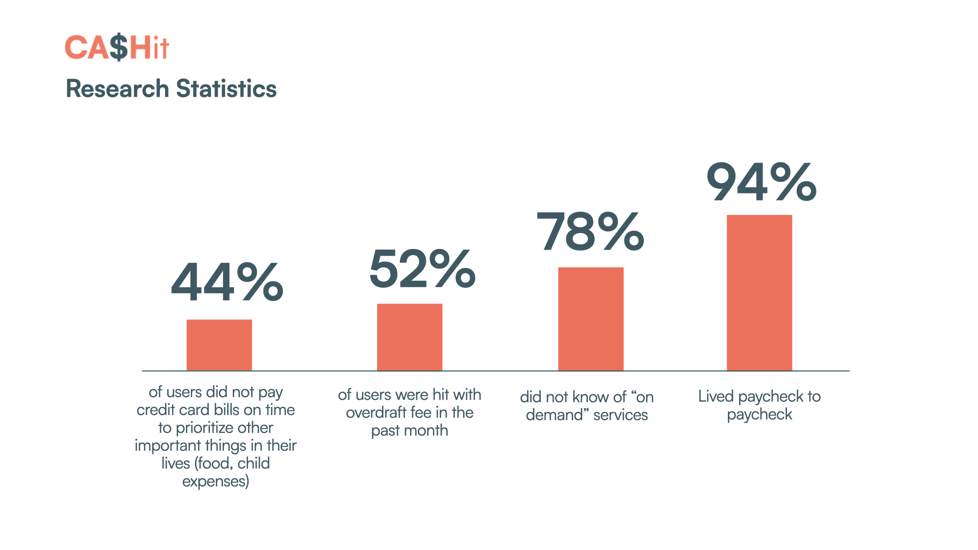
Research summarized
Users looked for quick access to cash flow and to improve their financial literacy. This played into our business’ adoption & retention goals.
• Most users lived paycheck to paycheck
• Getting hit with overdraft fees was the theme for the majority of my users
• Most users were ignorant to the “on demand” pay app market
• Users were open to get educated on and improve their financial literacy & decision making capabilities
My target users all had pain points that overlapped -
Wants & Needs
• Financial stability
• Improved cash flow management
• Easy access to funds
• Financial empowerment / education
Both my persona’s had a similar problem in their journeys -
They failed to stay on the happy path
Problem
Our users live paycheck to paycheck and get hit with unexpected bills that lead to expensive overdrafts. They need cash flow and better management of their finances.
Pain Points
• Overdraft fees
• Lack of flexibility of funds
• Limited financial visibility and insights
• Limited resources for financial education & growth
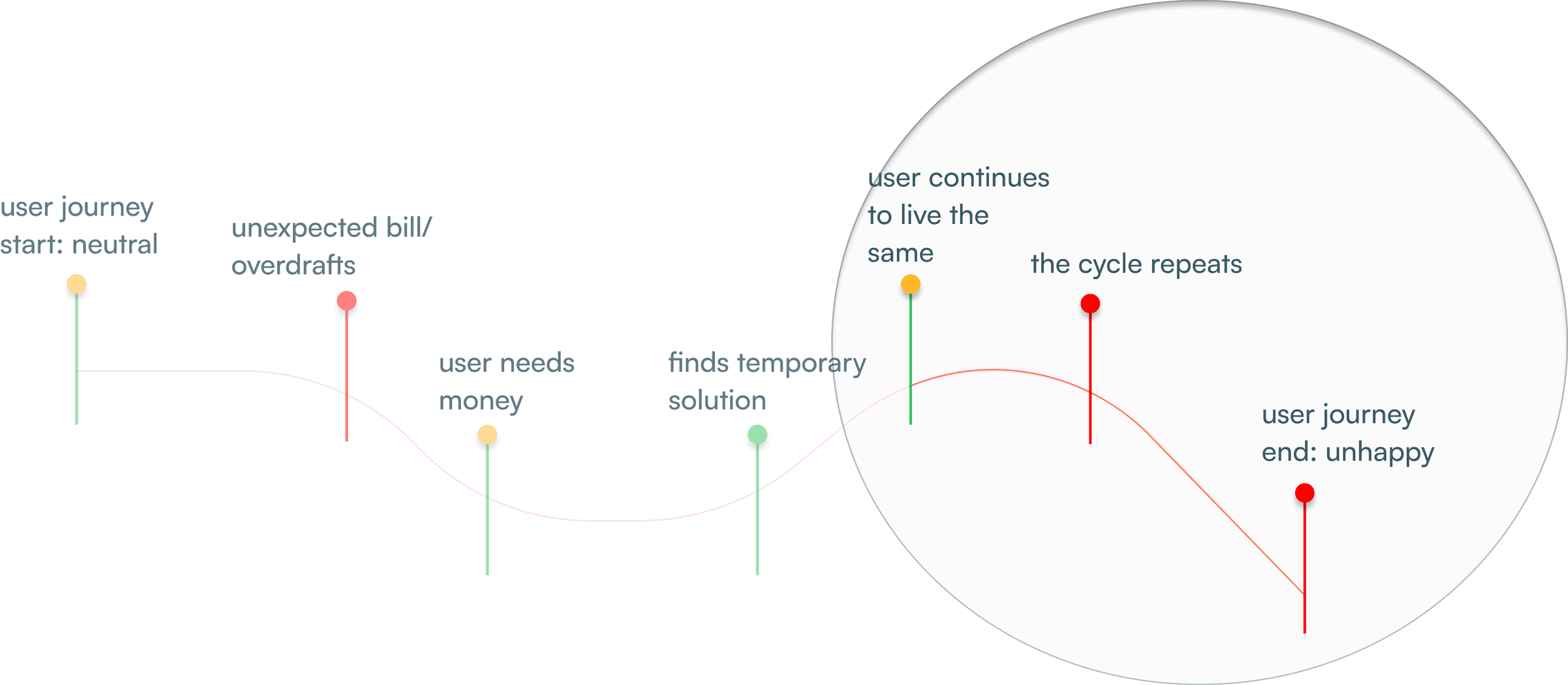
User Journey
Distilling the research
My Contribution to CASHit’s brand identity -
Collaborating with the product team, I created mood boards and came up with color theories. The style guide to the right ultimately established the robust brand identity for CASHit.

User Journey Findings
Our users failed to stay on the “happy path”.
Zooming into the last 3 touchpoints of our users’ journey reinforced our business objectives and led me to another possible proposition, that would influence our product roadmap for CASHit.
Influencing LCB’s product vision -
Product Strategy - ??? User Financial Empowerment
By doing some UXR I discovered a potential (core) value proposition for the business’ user retention goal. Empowering our users through financial education.
The Justification for the Value proposition -
Separating our vision from the rest in the market, we had to actually take an interest in the longevity & sustainability of our users’ happy path. This directly formed into the “user financial empowerment” product strategy.
How might we
design a financial app that empowers our users to effectively:
• Manage their cash flow
• Avoid overdraft fee
• Achieve financial stability
• Improve their financial literacy & decision making capabilities?
My client wanted to establish CASHit’s brand identity before we moved any further
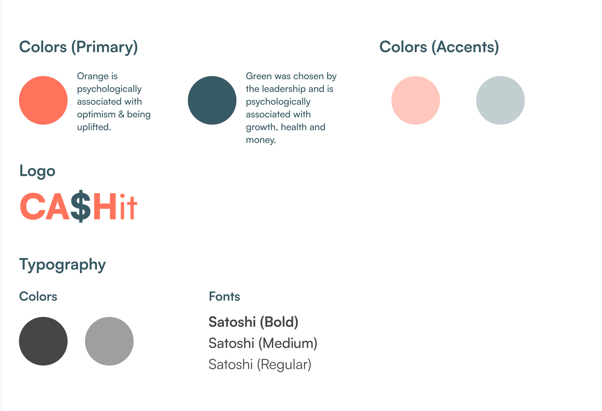
This style guide ultimately established the robust brand identity for CASHit.
Generating Interest in the user
required giving them what they wanted FIRST.
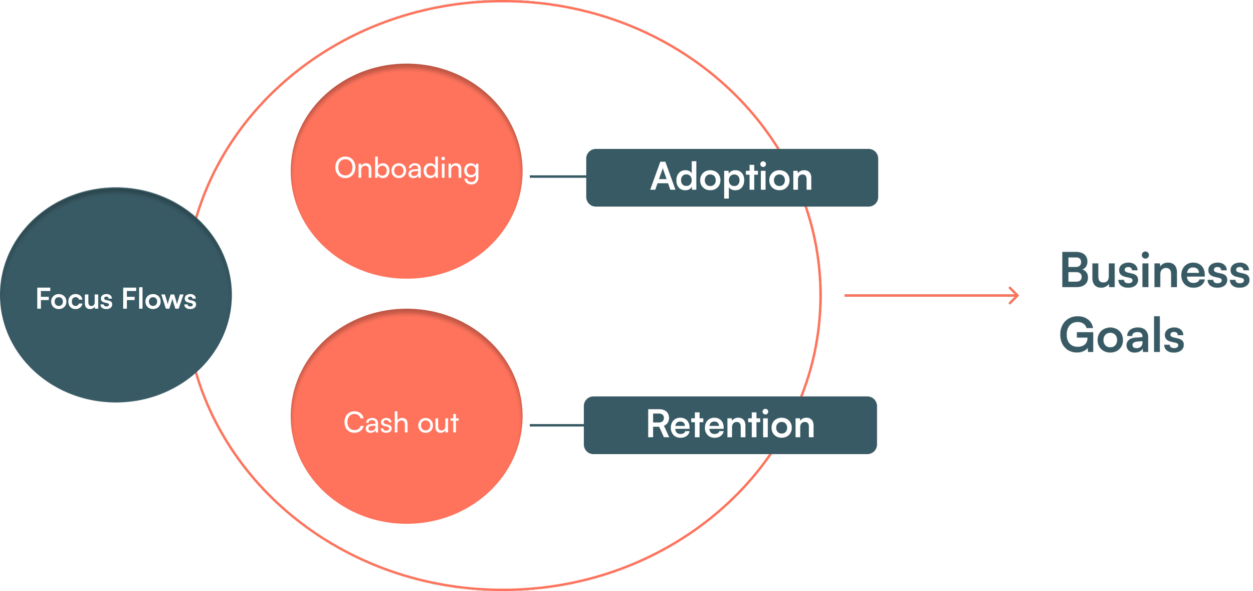
Keeping the business constraints & goals forefront in my process,
I focused on 2 flows -
1. Onboarding
2. Cash out
Testing the “cash out” use case hypotheses
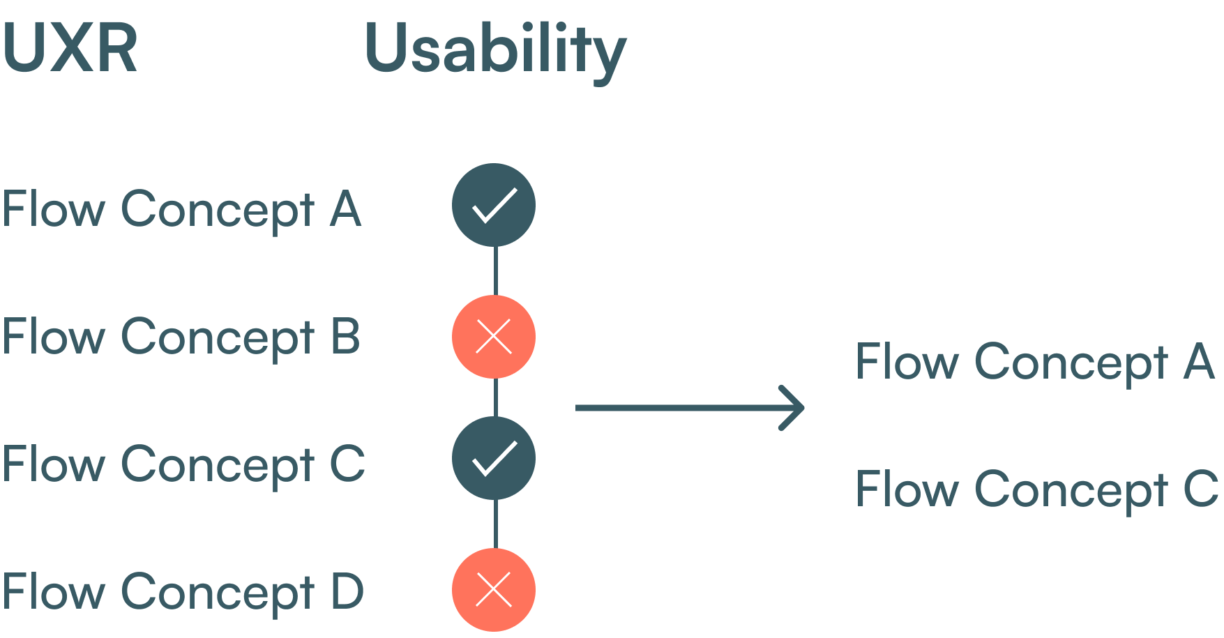
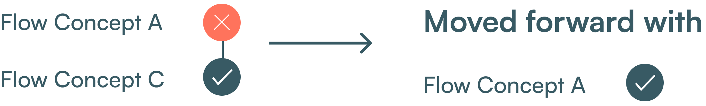
I tested out 4 use cases for the cash out flow, with A and C being the most usable of the 4. Then i A/B tested those 2, and had a revelation.
A/B testing
the micro interaction of the cash out flow,
Test Finding:
I realized not all battles can be won with data.

Flow Concept A
Why? Ditching near perfect usability for stakeholder/leadership vision.
Leadership decided to move forward with Concept C despite near perfect usability KPI’s on Concept A (select amount for cash out micro interaction). I had to come to grips with the decision as I felt it was limited & we took away our users freedom. Brigit did it this way, something about that app must be right, right?
Resolve (significantly reduced ToT for user)
#1 Removing the “Learn” section as it called the user to the same page the “Features” tab did, admittedly this mistake could’ve been avoided if we laid out a thorough architecture of the product beforehand.
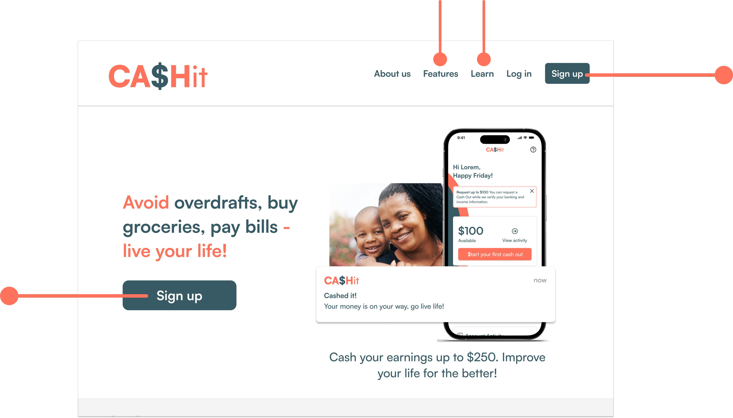
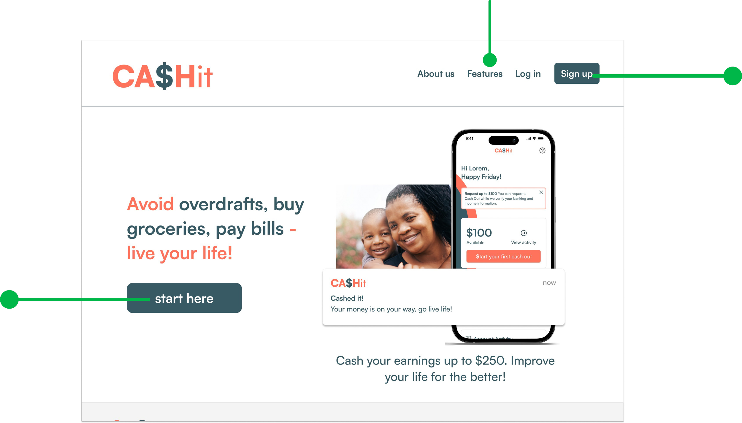
#2 Main CTA “Sign up” was changed to “start here” to cognitively let the user know they are about to be onboarded onto the product.
#Issue 2 (WCAG)
The font color weight was troubling some users as the user gave us visual cues by “exerting a certain level of emphasis” while looking at the sub text in these sections.
Resolve (users remained on happy path)
I iterated on the sub text going in favor of a darker grey (808080) to better contrast with the white background.
User Spending
User spending is a CASHit Plus+ added feature that will update a user’s spending in real time.

Flow Concept C

Our initial usability test uncovered some UX writing flaws & WCAG issues from the first iteration
#Issue (UX Writing)
Major UX writing flaws confused users specifically the Nav tab’s “Features” & “Learn” / multiple “Sign up” CTA’s
CA$Hit Plans
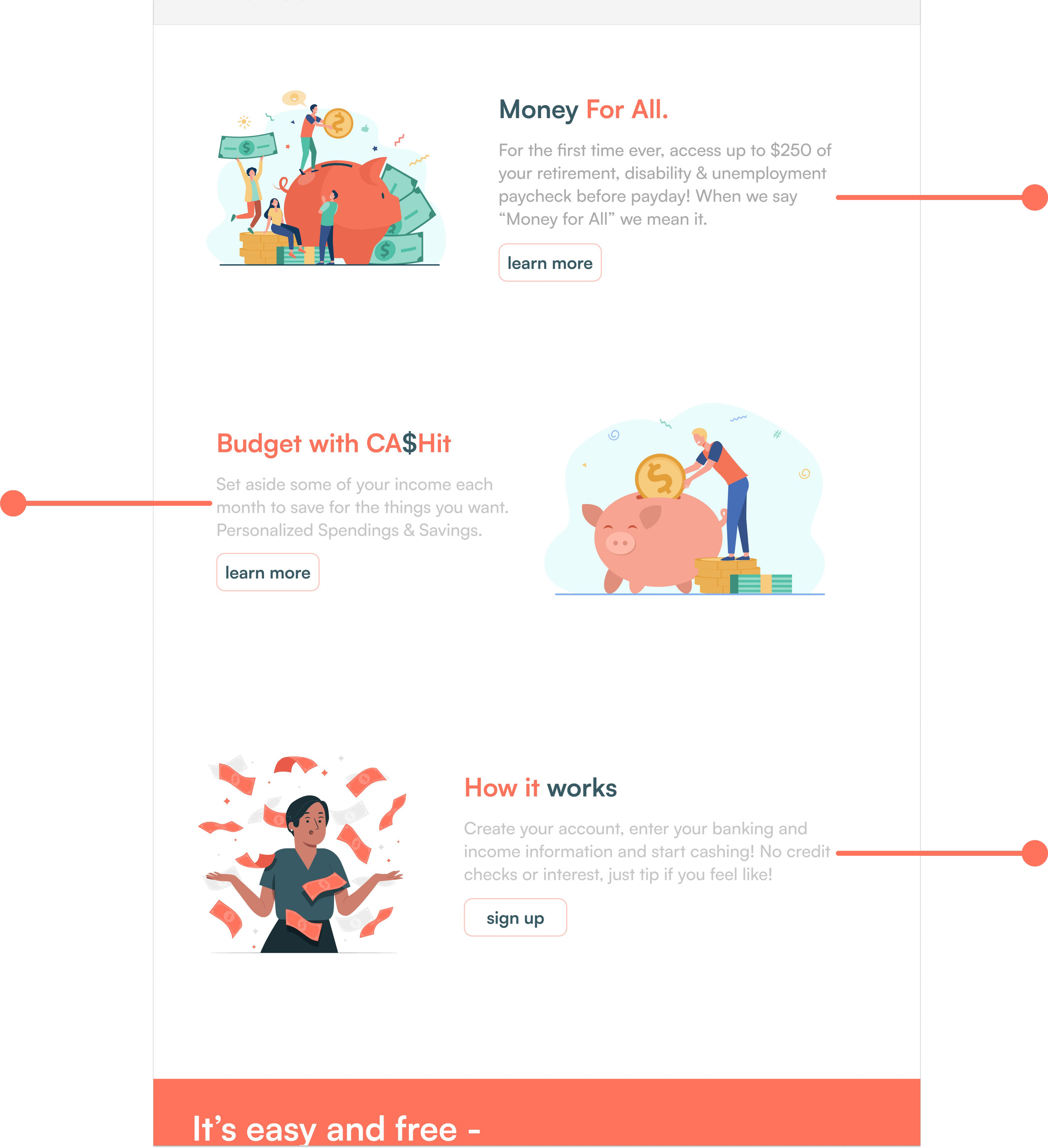
• CA$Hit (Free) - $2.99 charge on every cash out. $100 user cash out limit.
• CA$Hit Plus+ ($4.99/month) - Free of charge cash outs. $250 user cash out limit. Holistic features like budgeting, spend tracking, financial education etc.
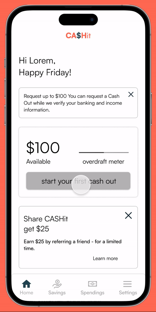
User Cash out
For the business - This flow works both business’ strategies (Adoption / Retention)
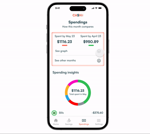
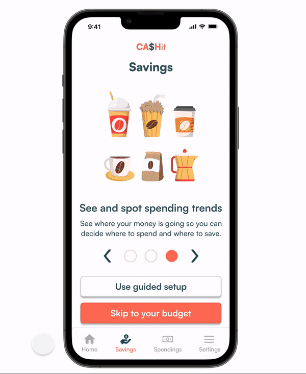
User Savings (budget)
Holistic propositions were the business’s primary goal. This CASHit Plus+ premium feature sustains our user’s happy path and incentivizes real financial change for our user.
Dev Handoff
After finalizing the High Fidelity screens and Prototypes, our team prepared a detailed Developer Handoff to ensure a smooth implementation. I included the flows and specifications and ensured the handoff process was as smooth as butter. Additionally, I made annotations of the design elements and their functions. Using Figma plug-ins such as “Autoflow” and "Annotate It!" helped make the handoff organized and easy to comprehend. Providing as much helpful information as possible helped bridge any communication gaps between our designs and the development.