Disclaimer
This case study highlights my product thinking skills.
This conceptual project was done in 1 week as part of a take-home project at Gap Inc.
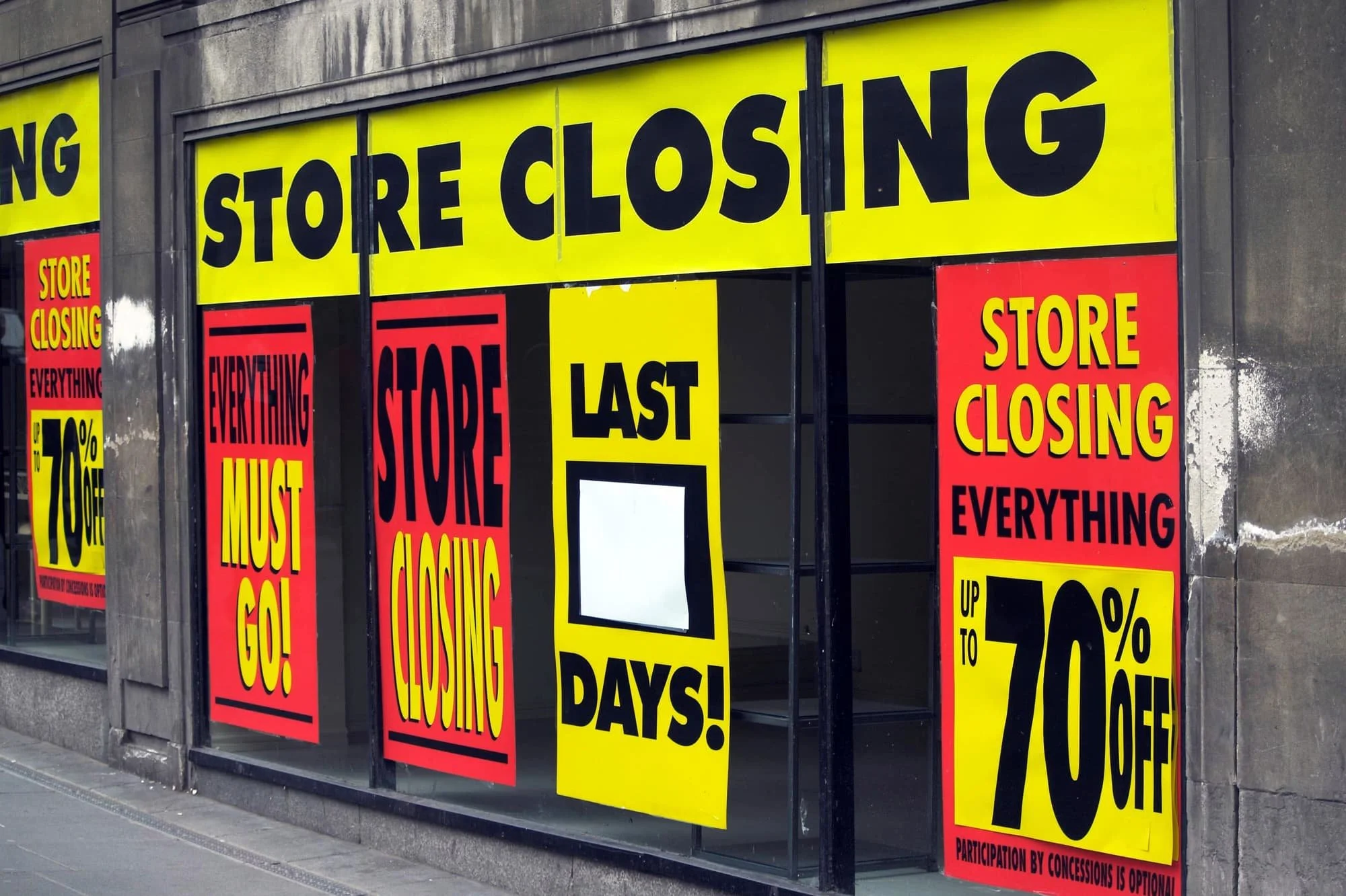
A retail store closure in Brooklyn, NY
Banana Republic Operations
is an application that allows the users to streamline their current store data and communicate/collaborate with their respective teams to optimize their store’s performance.
Duration - 2 Weeks
My Role - Research/Evaluate, Wireframe and Prototype, User Testing and Iteration
Main Tool - Figma
Platform - iOS/Android Tablet

Impact and Outcomes
Qualitative and Quantitative
Project Goal
The goal of this project was to evaluate the users’ current workflow applications, and iterate/consolidate the brand’s current system application data into 1 application. This would help the managers at BR to cut down time to overlook the data necessary, while also assigning specific tasks to employees based on that data to optimize store performance.
Context
CNBC estimates about 50k U.S brick and mortar retail store closures by 2026 following the pandemic. This has created a massive emergency for stores to optimize their sales with the foot traffic that do enter the physical stores, and this requires the store personnel to communicate within their team effectively and switch strategies based on hourly store performance.
Problem
BR administrators currently are dissatisfied with the time it takes to overlook necessary data pertaining to the store’s performance. They currently utilize 4 separate applications to look at data that changes every few minutes. This has been an annoyance in their goal of optimizing their workflow to meet the store’s daily metrics.
Oversee Shipment

Challenges and Breakthroughs
• Cut down user time on task by 70%
• Increased user satisfaction by a 100%
• Improved communication between teams
• Potential positive impact on store performance i.e increased sales, loyalty acquisition, conversion rates
See Process Below
See full (kinda) process below

Challenge : During context gathering (research) i struggled alot with avoiding confirmation bias (me being a former employee at banana republic i knew how most things worked)
Breakthrough : Searching up techniques on how to NOT influence your interviewees on youtube and putting them to use, i feel like i became a much mature interviewer during this process
Challenge : From a technical standpoint i did not know the reason for why the workflow tools were designed the way they were designed, this required me to establish rapport with the Gap Inc. developers
Breakthrough : As a designer with no prior experience in the field, it was a check list moment for me to say that i have collaborated with developers. Also communicating with the in-house developers gave me alot of confidence in the direction for my solution
Cutting Time on Task for User - Cutting Time is Cutting Costs for Business
Improve Communication - Seamless Communication between teams would mean Driving up Revenue for Business
My Solution
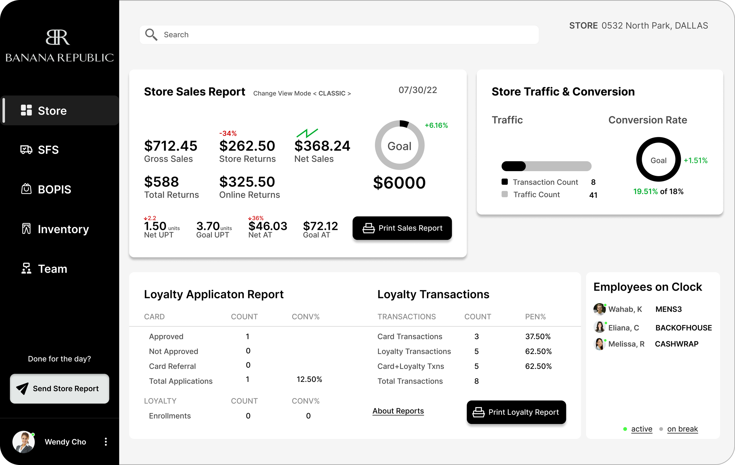
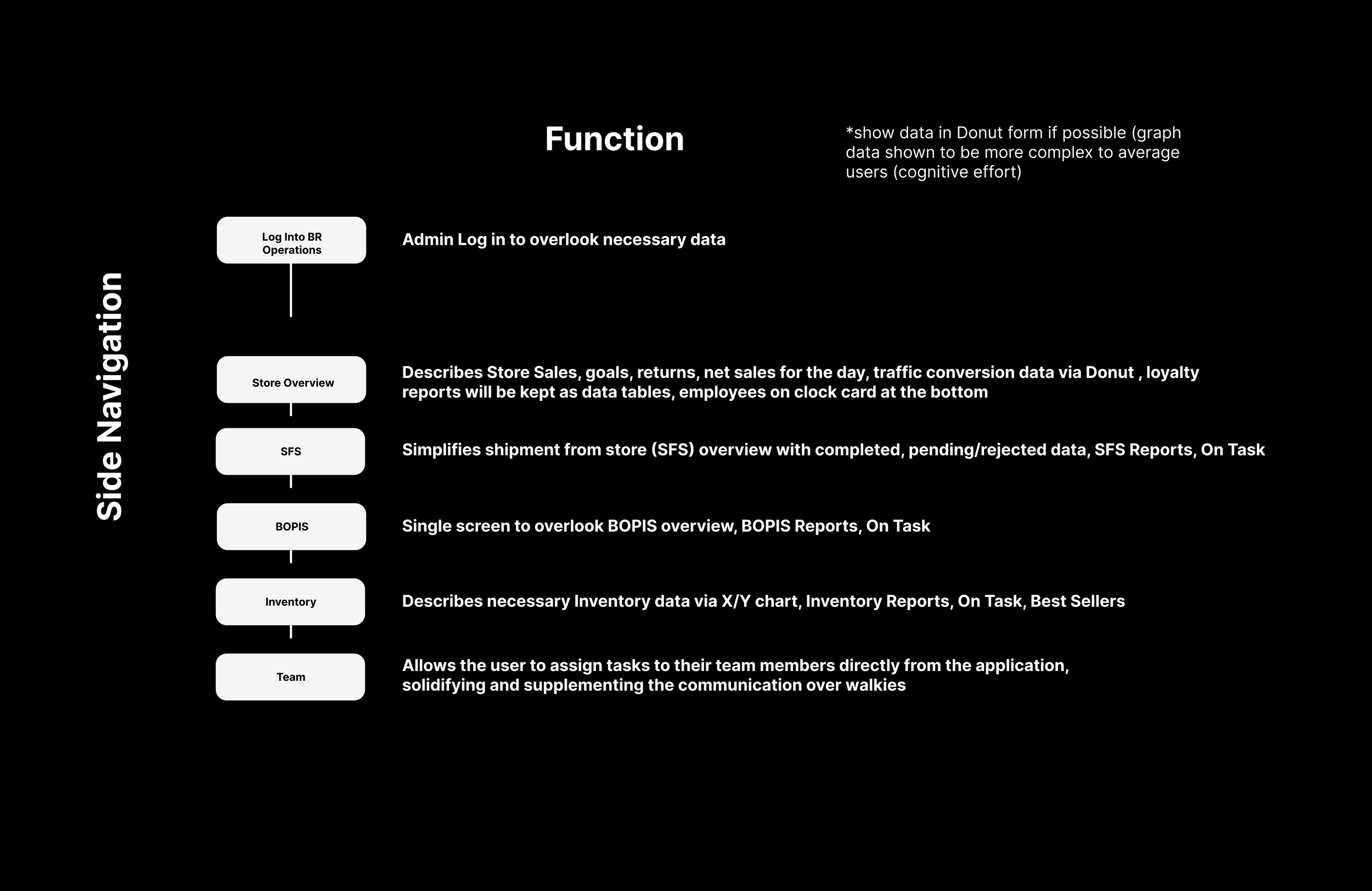
Allows the user to oversee *ALL* necessary data paramount to store performance, from 1 application
Currently it takes about 5 different applications at Banana Republic to accomplish this.
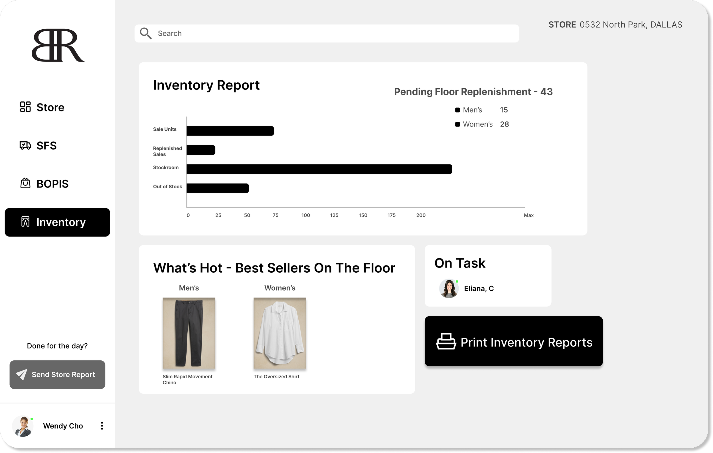
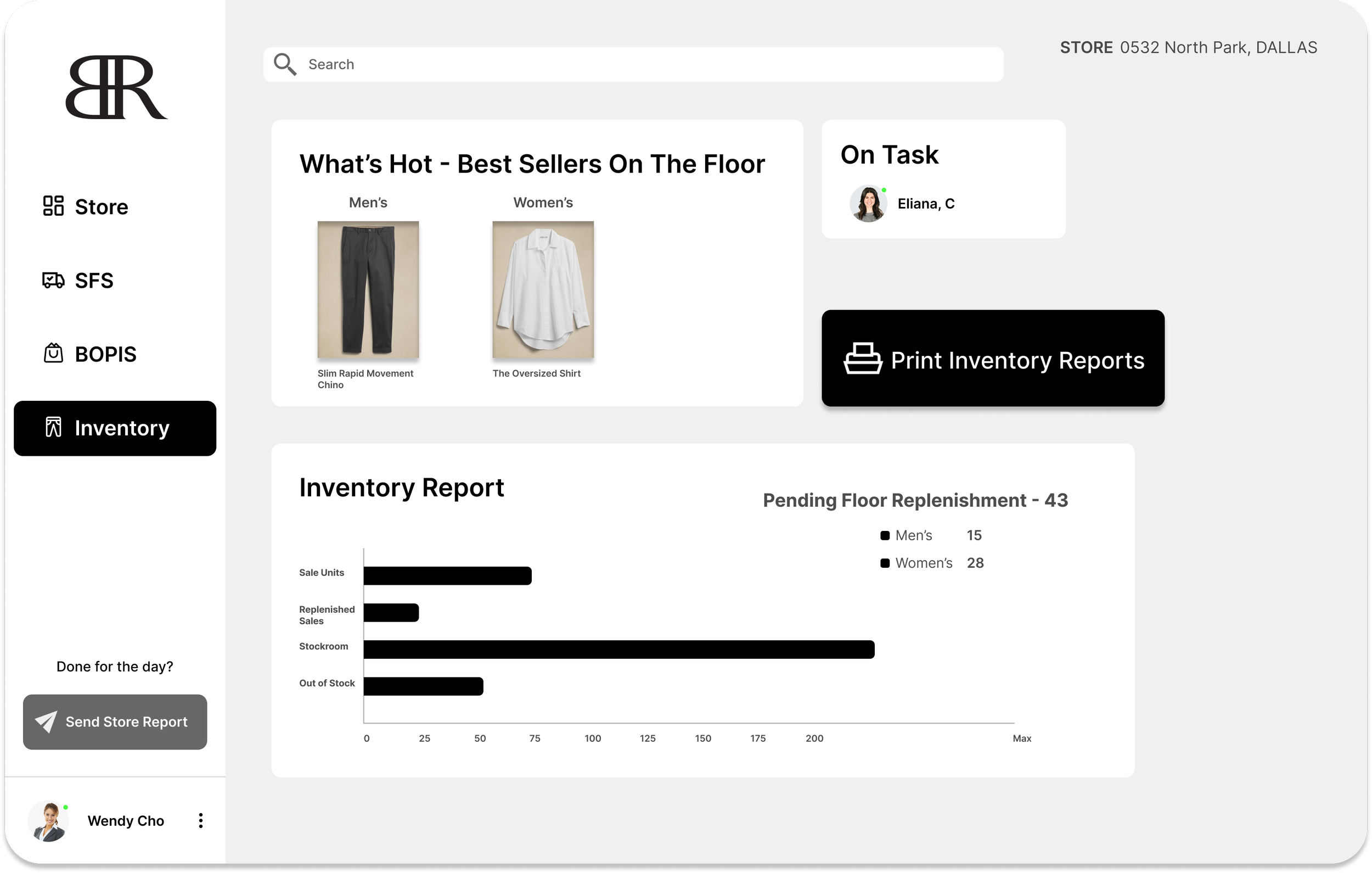
Overlook Store Data
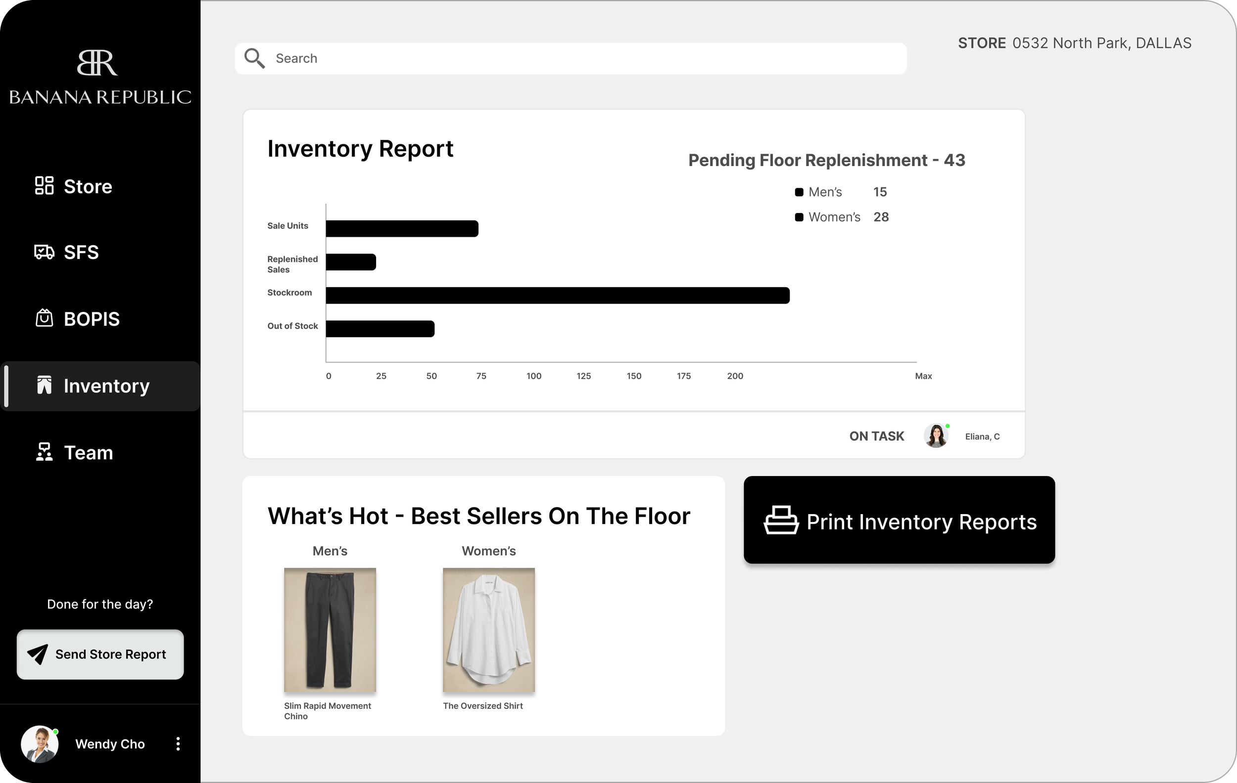
View Current Stock/Inventory
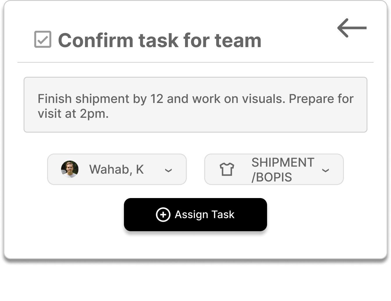
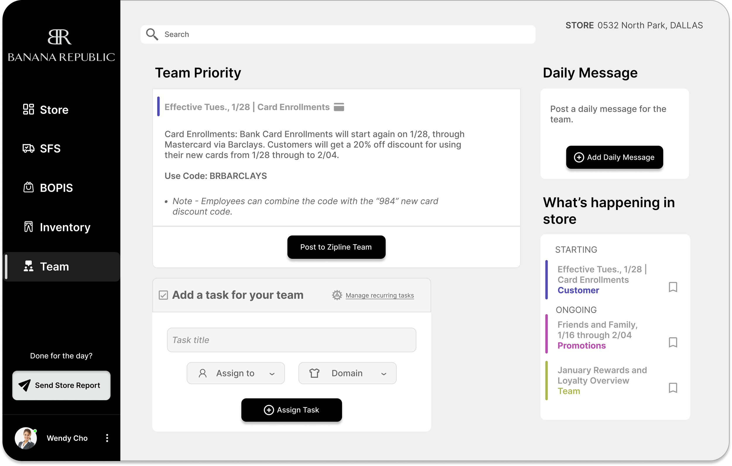
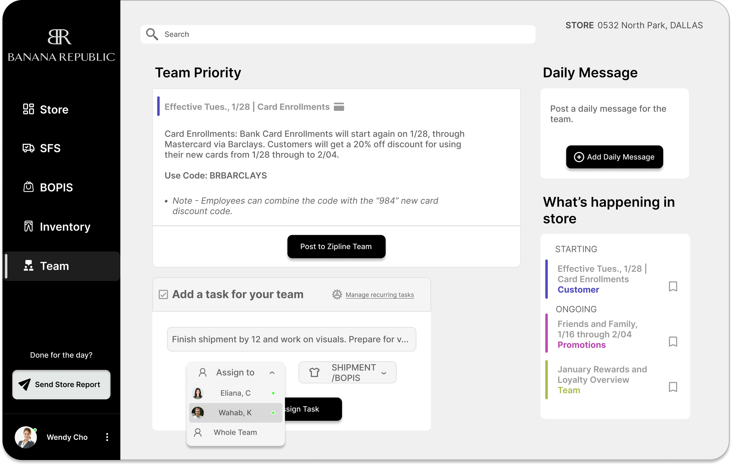
Assign tasks to employees through the app based on current store performance, or make adjustments regarding team strategy
BR Operations thrives on streamlining data to users so they can communicate with their team to optimize store performance. All done within the app!

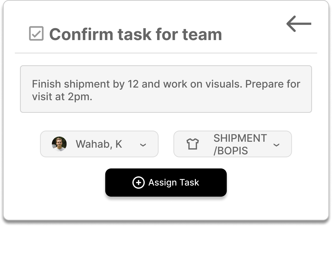
Assign tasks
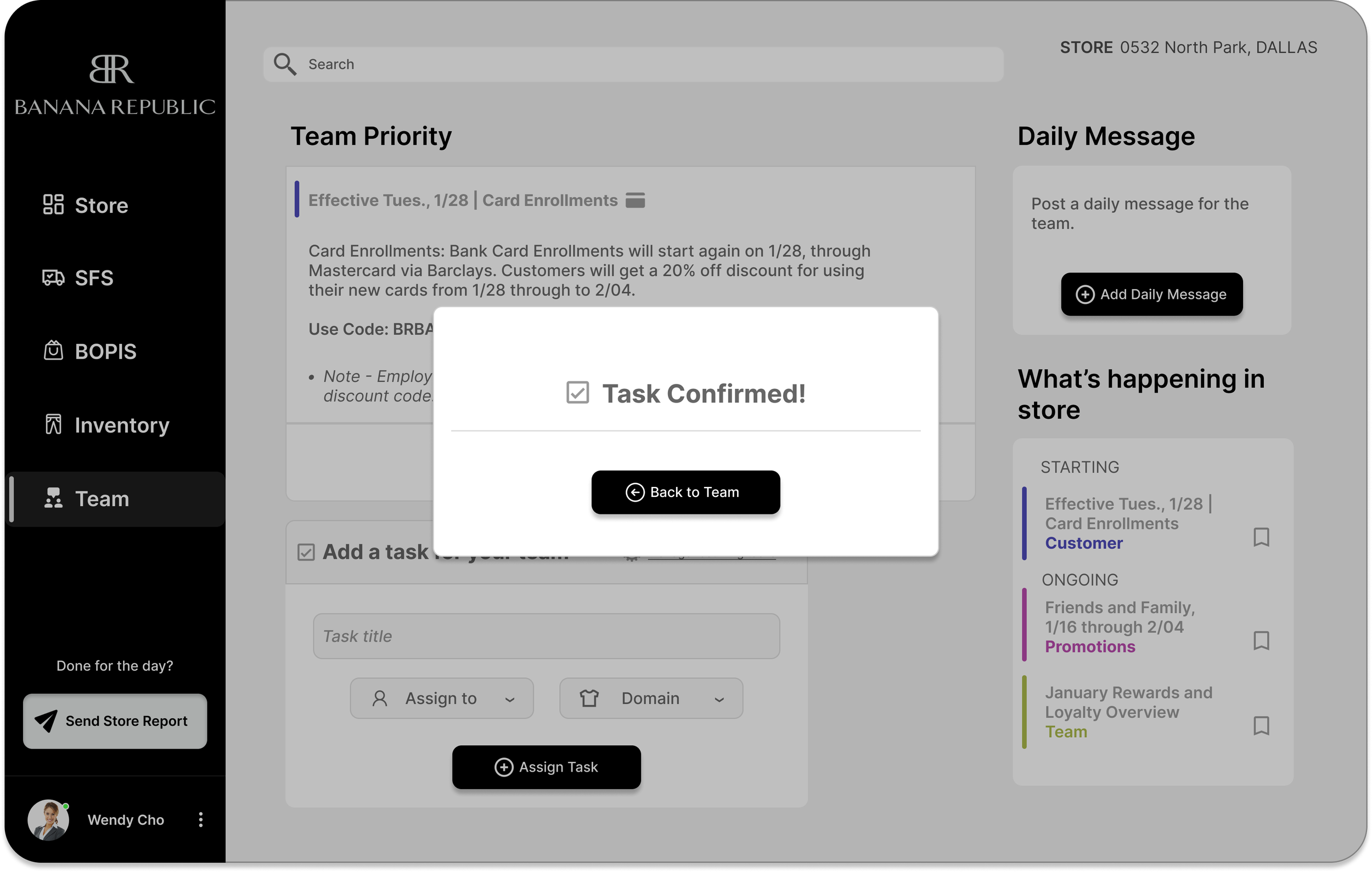
Task is assigned
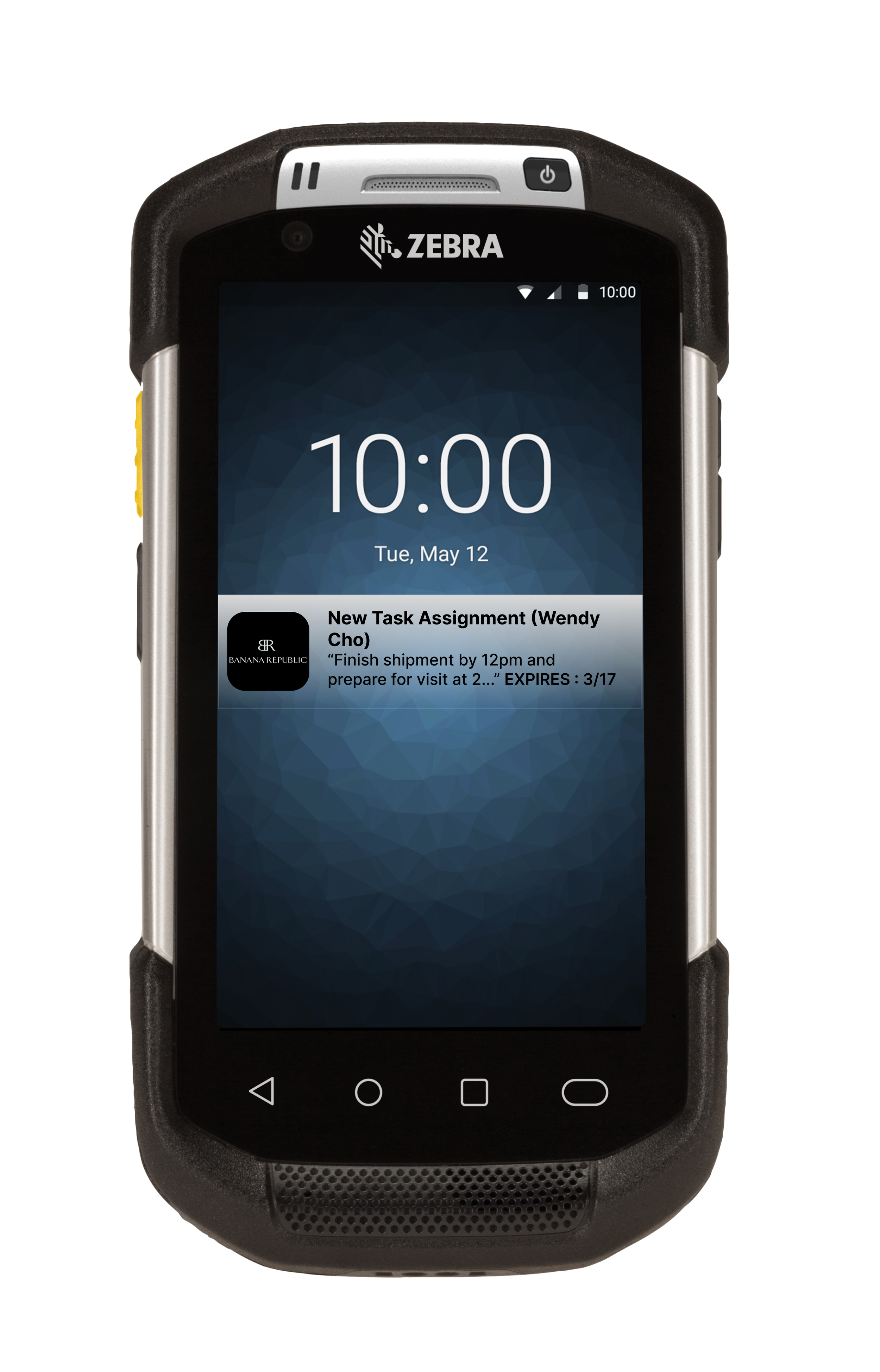
Team member is notified
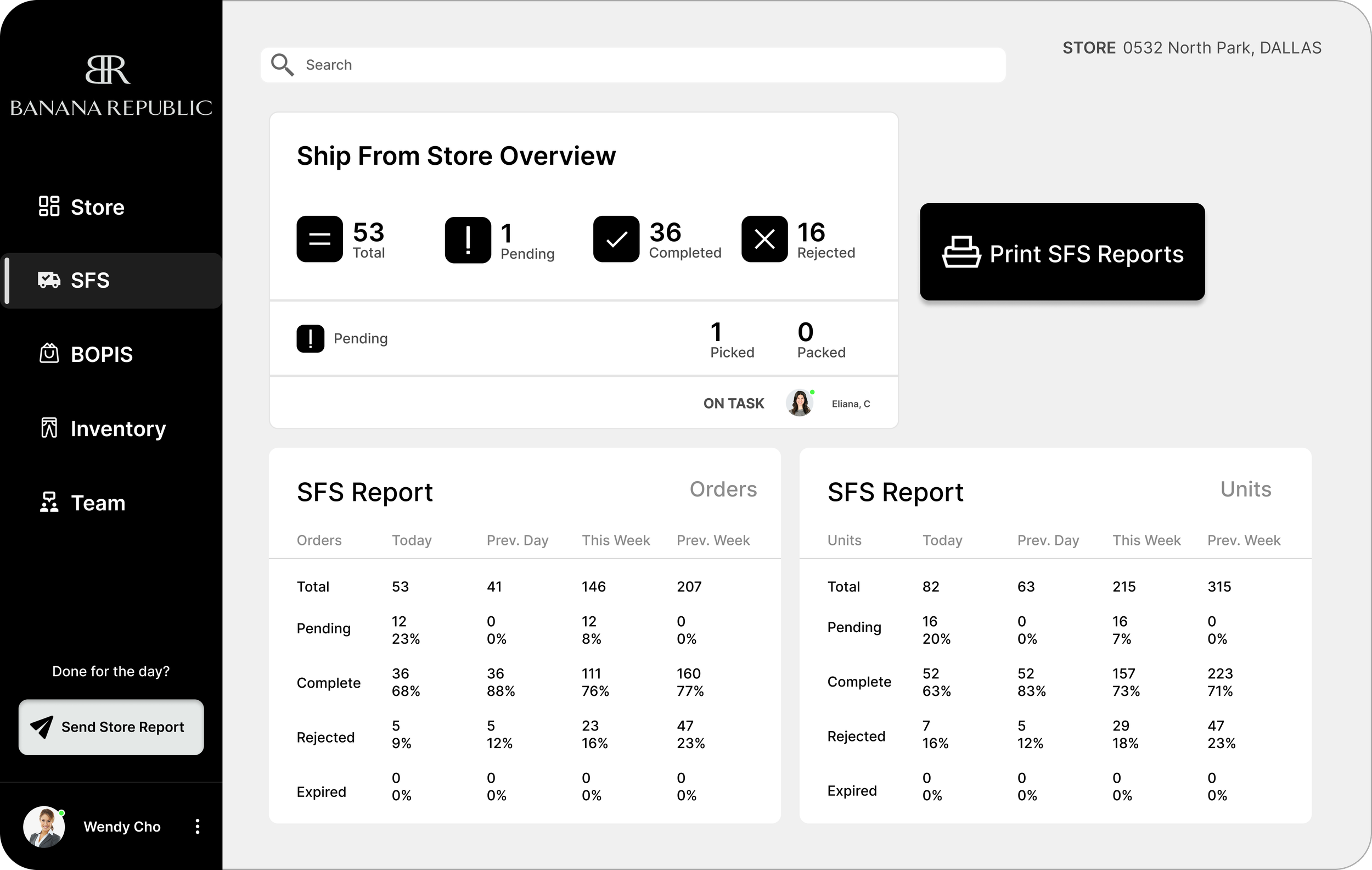
Streamlining data that changes every few minutes, from 1 application
Cutting time is cutting costs for business.
Confirm/Edit said tasks

Project Key KPI’s
Adding a dimension to Manager - Associate communications
Communication over walkies is great and still the strongest method of communication for stores, but my research proved some verbal communication to be lost when the store gets heavy traffic.
Evaluation of current systems at
Using Steve Krug’s “Cognitive Effort” design principles found in his book “Don’t make me think…” along with experience mapping my users, I was able to gain cognitive insights into the users workflow.
Gathering Context aka Research
Insight : Users were not satisfied with their workflow tools
Through user interviews i gained insight into the management teams workflow. All 6 of my interviewees were not satisfied with their current workflow. They were most frustrated with the application flow during the store’s busiest hours. Multitasking between clients and employees, setting store goals and connecting with their respective teams, they were looking for efficiency in their software applications.
The Management Team used 4 main applications to keep track of hourly data:
Zipline, Sell, Fulfill, Inventory
My next step would be to evaluate these current workflow applications with a contextual inquiry
Various methods were used to uncover the problem. User interviews and Contextual inquiries were made with the managers on location of the store. I observed and evaluated and asked questions regarding the admin teams current workflow.
On-site Contextual Inquiries led to Experience Mapping the user
Visiting a Texas location of the brand, I shadowed 3 managers to evaluate their current workflow. I asked questions and noted their satisfactions and frustrations within their current workflow. I derived 2 main pain points from my experience with the users, which overlap and go hand in hand.
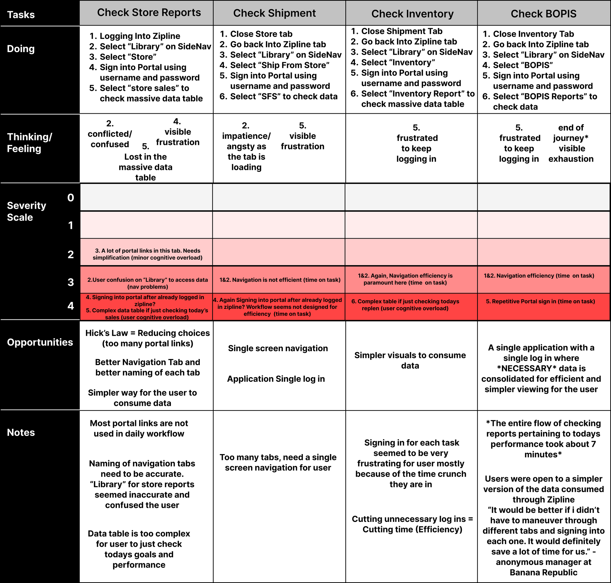
Experience Mapping Users Current Workflow
Insight - 7 minutes to overlook entire data that changes about every 30 minutes
Pain Points - Constant log ins and switching between apps / Complex data formats
Themes - Navigation Efficiency and Data Complexity
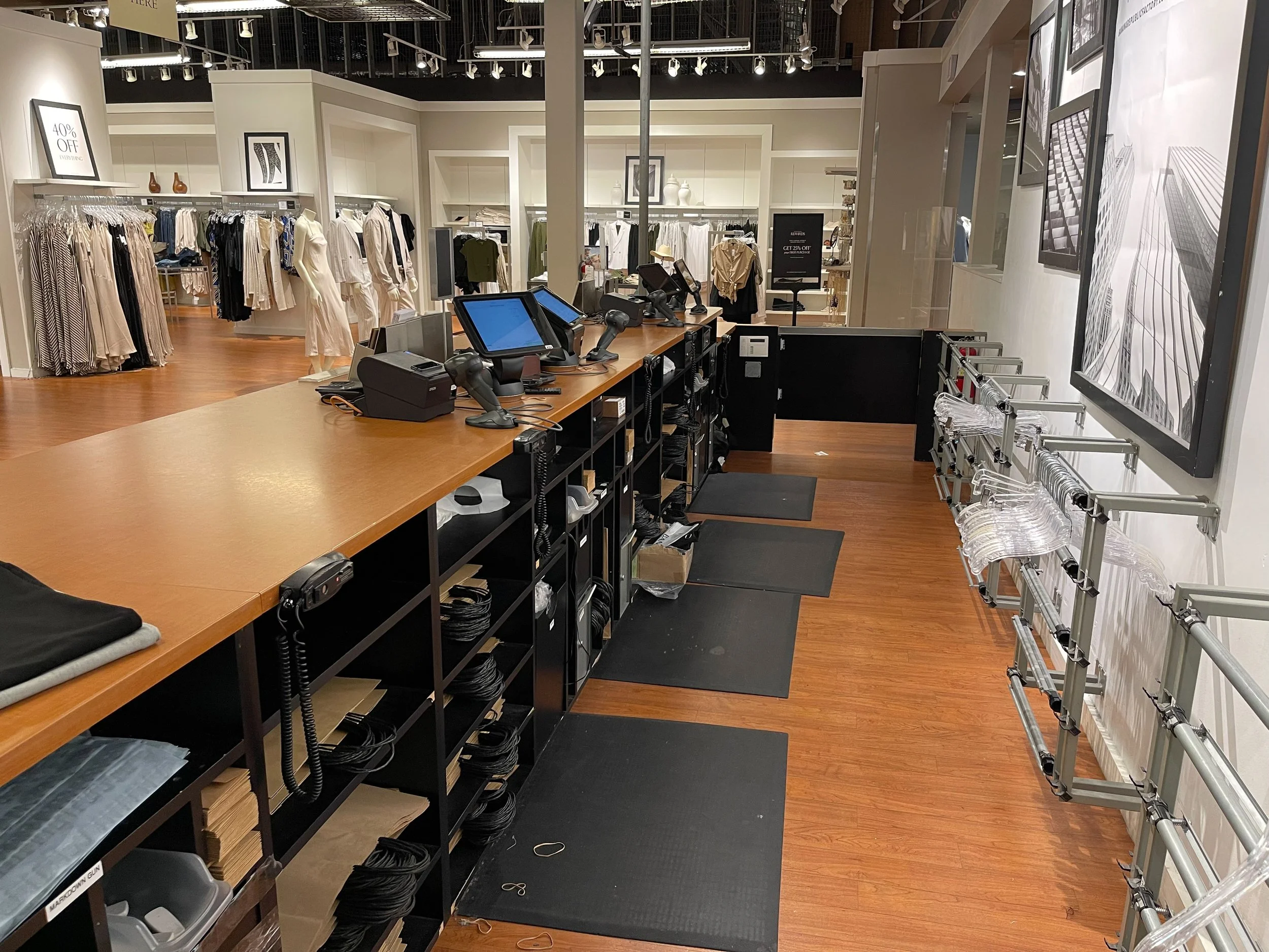
A location of the brand (my interview location)
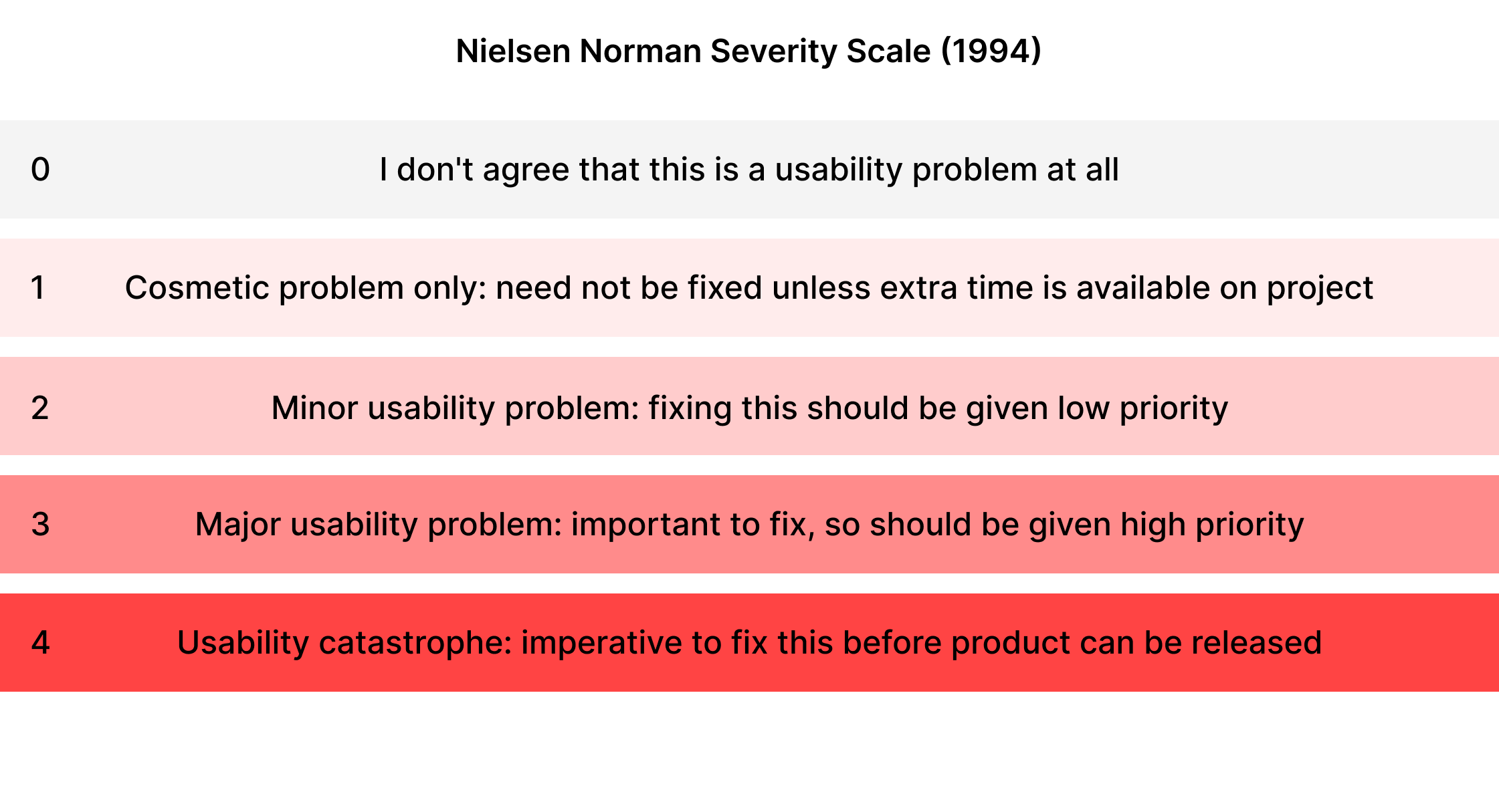
Severity scale for evaluation
I used a Nielsen Norman severity scale to help aid me in my contextual inquiry by using it to evaluate the flow of current applications at BR.
Goal/Hypothesis - Redefine the existing workflow to make it considerably faster, efficient and engaging for users by consolidating essential data in a single application in a simpler more digestible format (to reduce cognitive effort).
Problem - How might we cut down the time it takes for the users to look at necessary data without having to constantly log into different platforms?
Post the evaluation / system checks, i was ready to iterate on current tools and work on possible consolidation
Using content models to structure *necessary* content
Now the challenge for me as a designer was organizing and designing data not only in a visually appealing way but also making the content digestible and consumable on a single platform (erasing the need for the user to switch between multiple applications to overlook/consume the data)
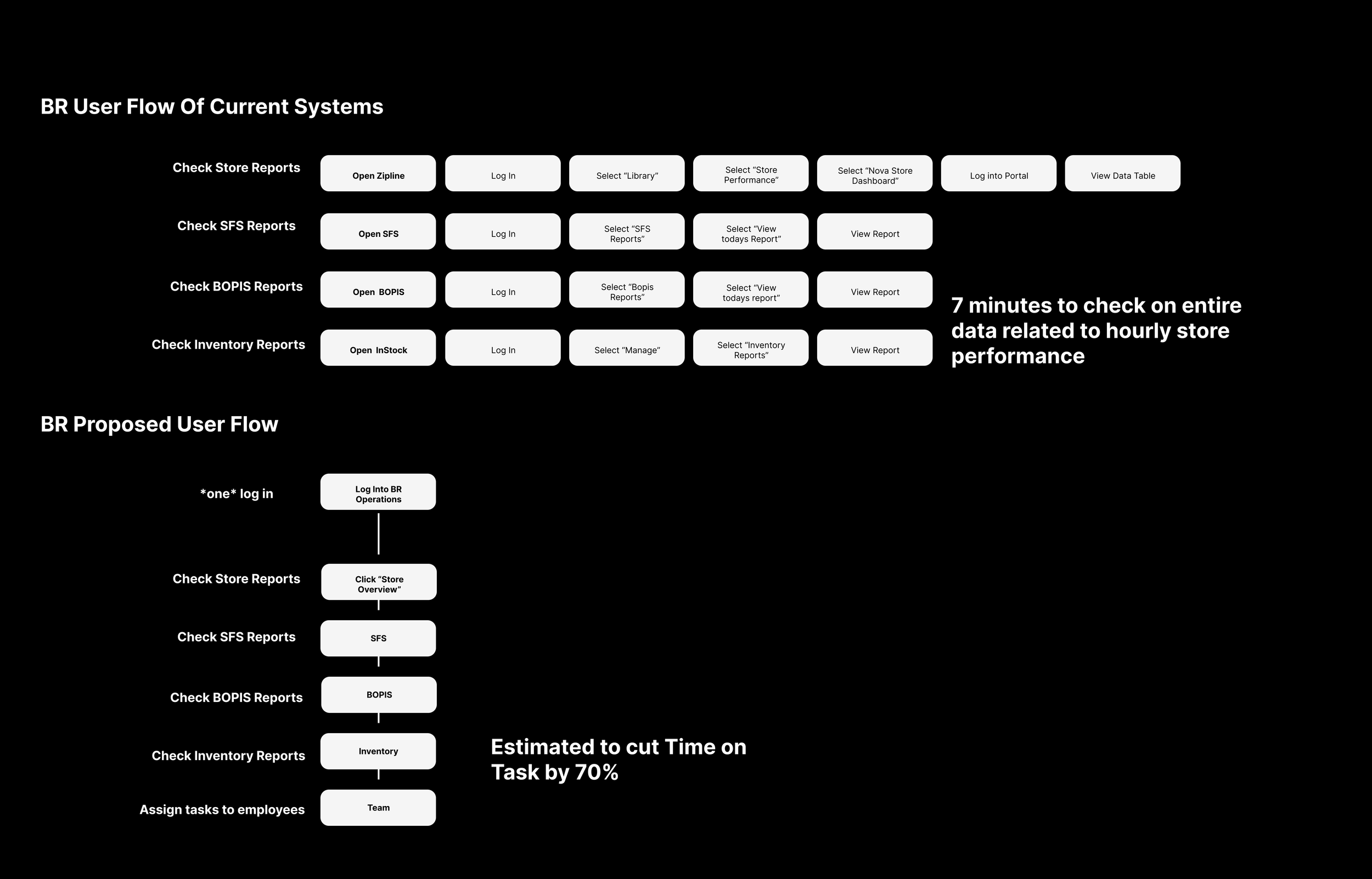
Current User Flow & Proposed Flow
Proposed user flow cuts down time on task by an estimated 70% by reducing the amount of logins and eliminating the need to switch between apps
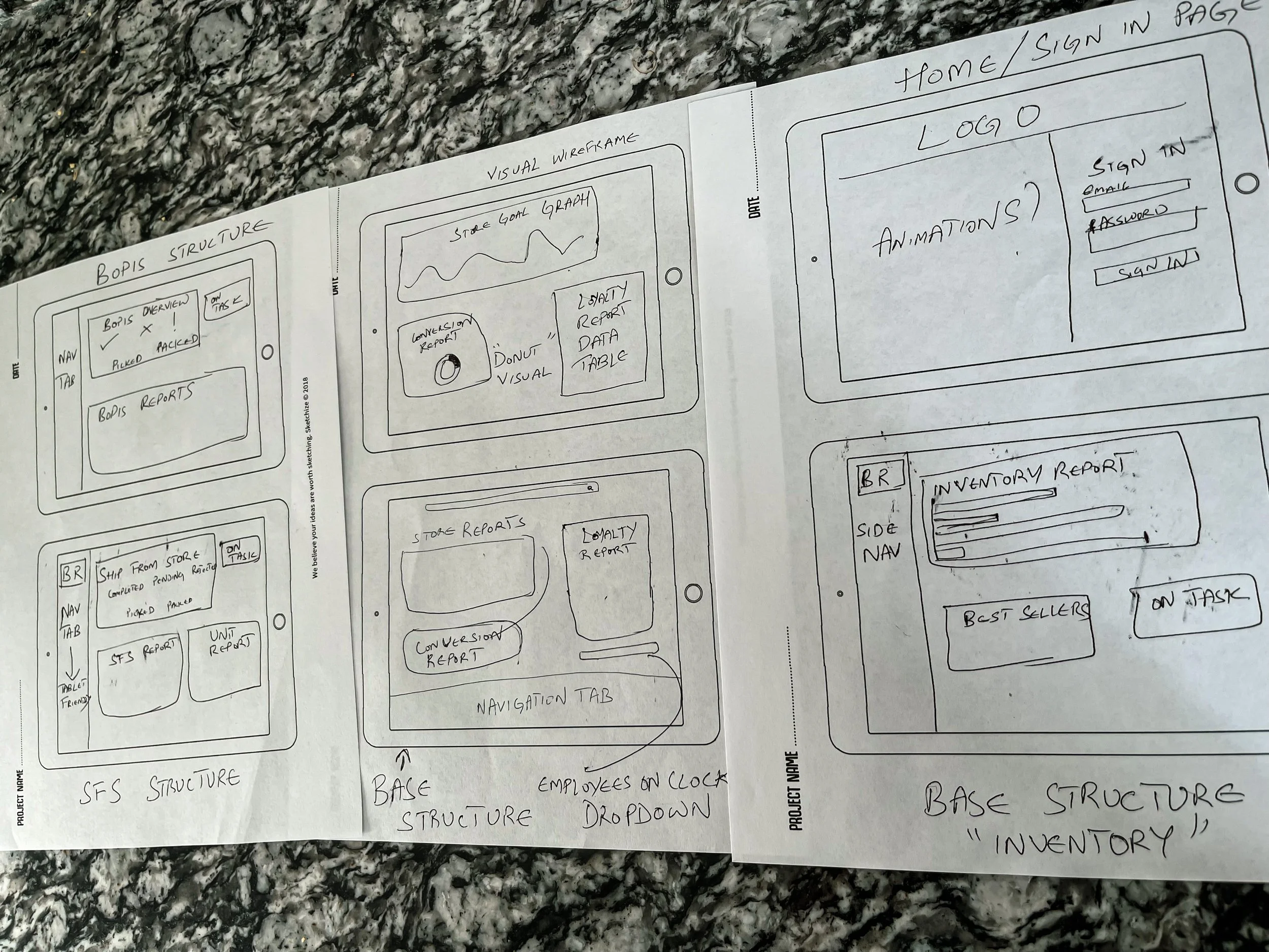
Content Models/Sketches
Content Sketches
I sketched the content into tablet screens to see if i could fit all the necessary data into a single screen without the need for scrolling. Once i was convinced it was possible, i went ahead with the digital wireframes.
Wireframes + Mockups
Skeleton Structure : Basic structure/layout for each screen
Content organized by hierarchical importance in the form of cards
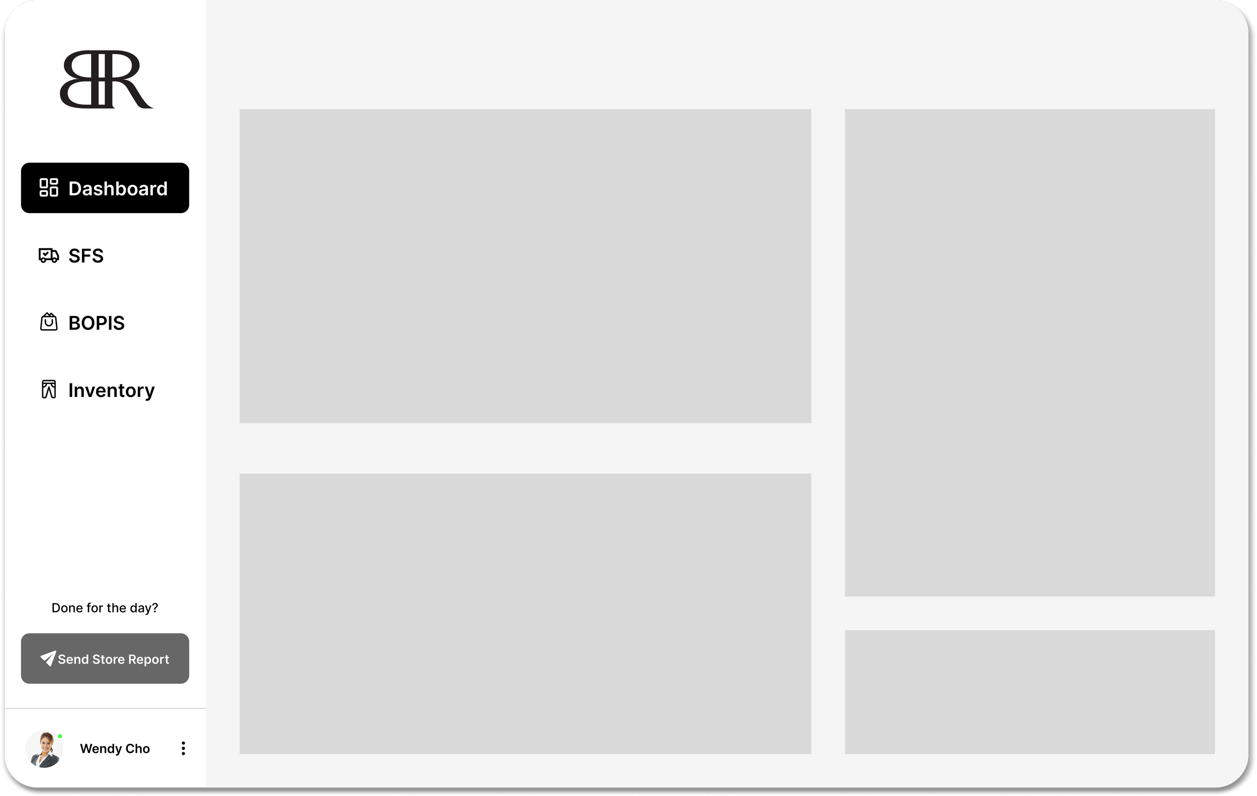
Mockup Draft
First draft of mockup: Upon user testing this version of mockup, users found the visuals a little overwhelming as they were unfamiliar with the data structure. Also, hierarchy of data was brought up.
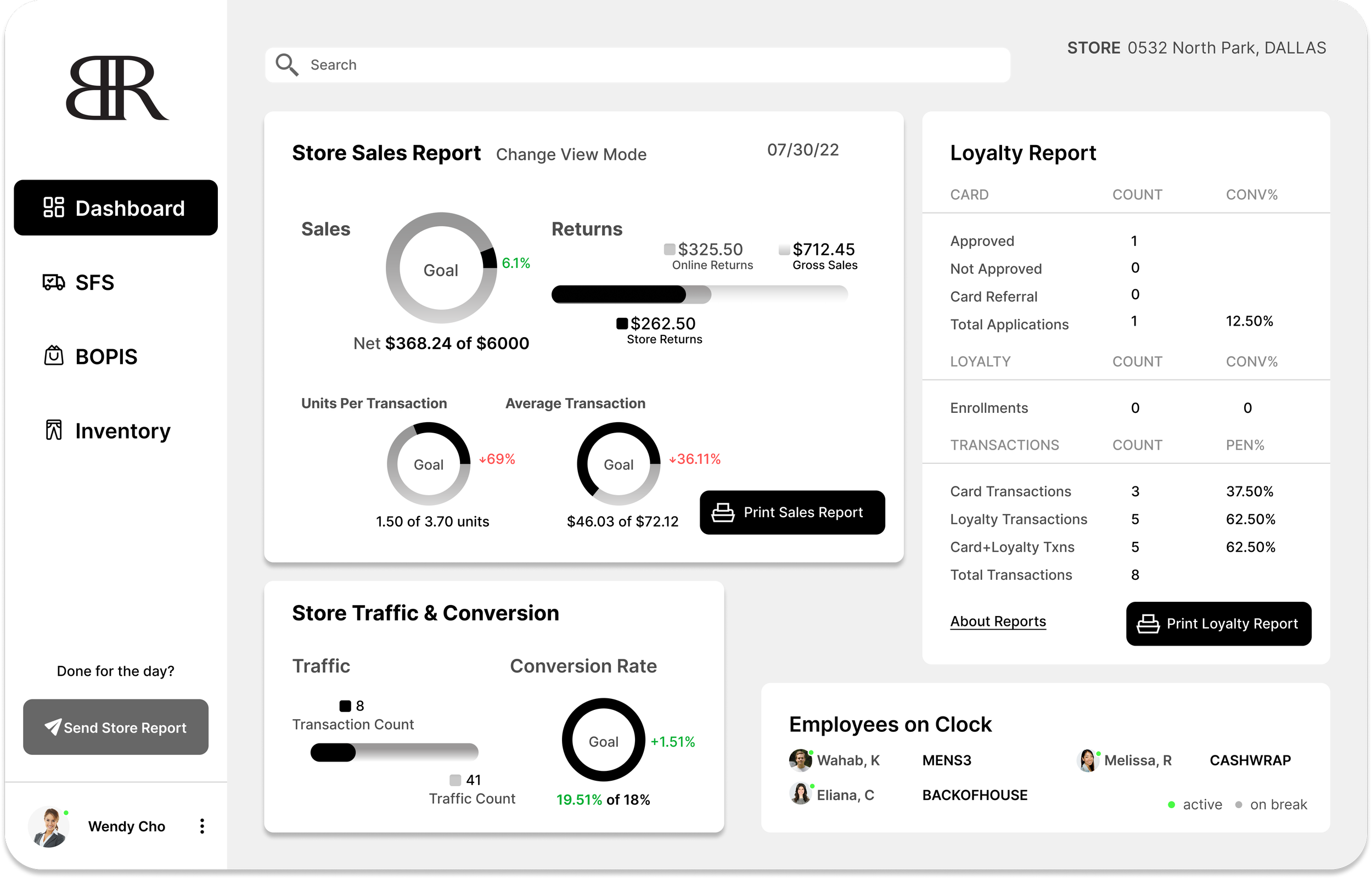
Usability Test
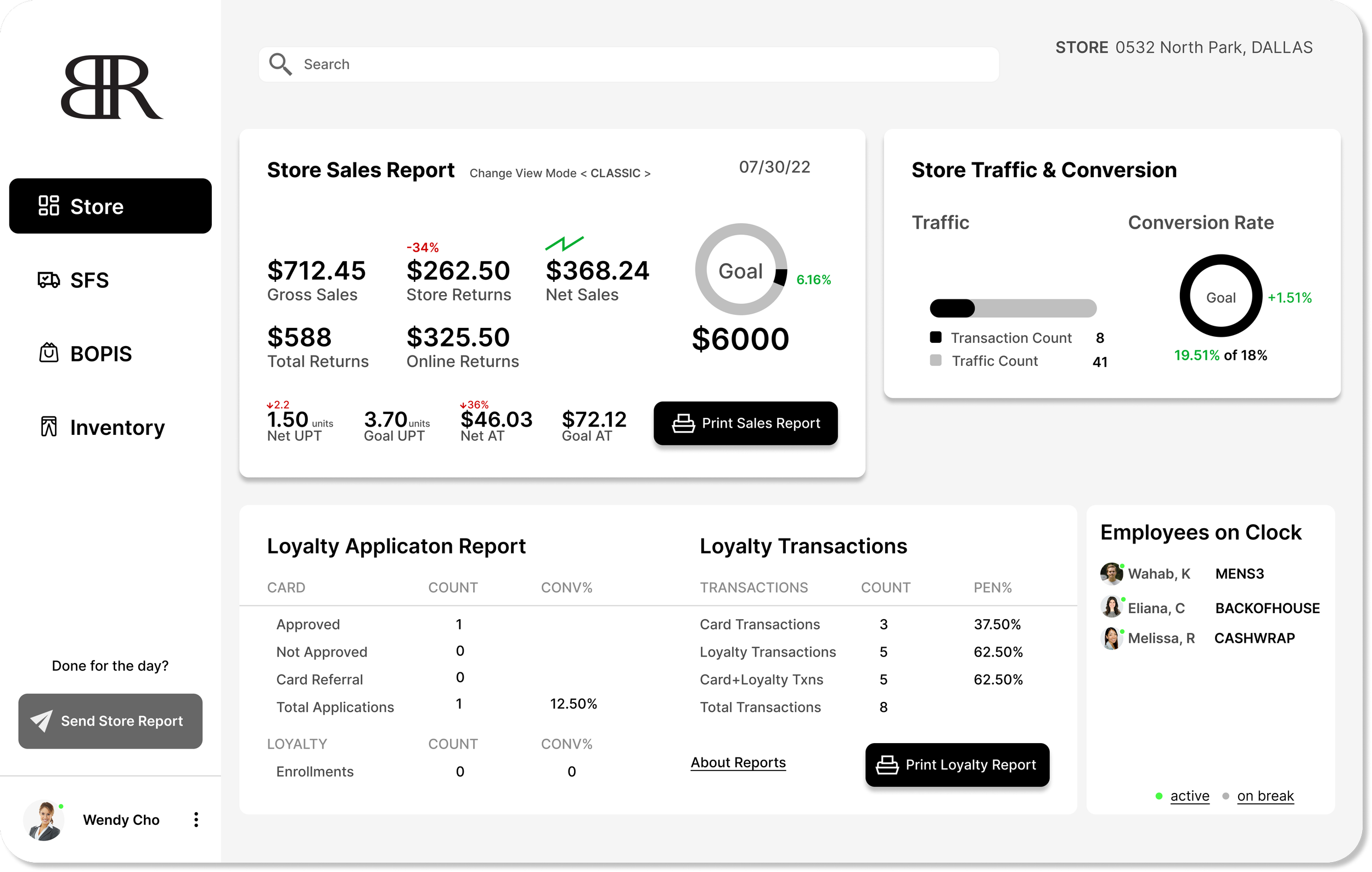
After testing my initial prototype, i gathered feedback centering around my choice of visuals used, and hierarchy of content. Seen below are the final mocks of my project, rectifying usability issues that arose in the previous version.
First draft of mockup: Upon user testing this version of mockup, users found the hierarchy of content a bit off.
Final draft of mockup: The data donuts were made minimalistic and gradient color was removed because it seemed out dated and lackluster. Pertaining to the hierarchy issue, I switched around the “Store Traffic” card up to the right of the “Store Report” card. Loyalty Report was restructured to fit at the bottom.
Designing a flow that allows assigning tasks to employees based on store data
Following the accomplishment of presenting data on a streamlined platform, i took inspiration from Zipline and added a task assignment flow directly into the BR Operations app; again to cut down time and improve productivity for the team. (Managers currently switch back into Zipline to assign tasks for the team/employee)
Assigning tasks flow :
Iterated Draft

Mockup Draft
Iterated Draft

Iterated draft of mockup: I restructured the content and put the Inventory Report up on top so the users attention goes to it first as that is the main focus of the page.
Content Models for structure and function
Side navigation and single screens (no scrolling) in one application covered all essential app data from Zipline, Sell, Fulfill and Inventory
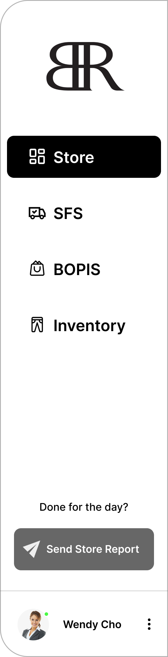
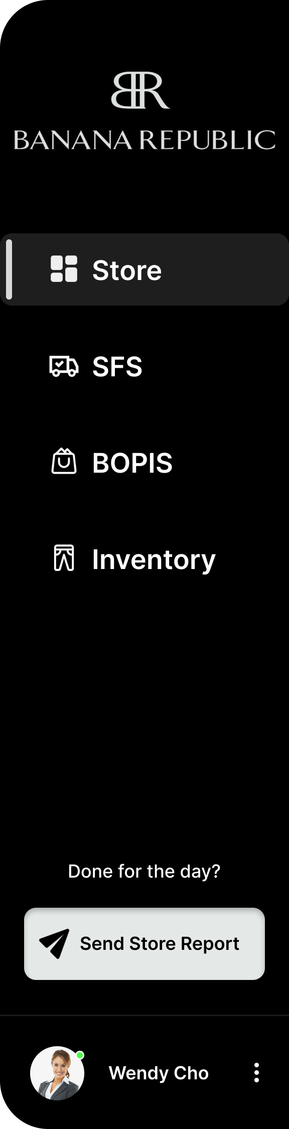
NavBar (UI) changes
Mentor Feedback
• Logo was inconsistent when compared to the login page
• UI visual and interaction states could be improved
• At the bottom, gray action button looked inconsistent with the visuals of the nav bar
Iteration
• Taking notes from Instagram’s dark mode webpage, i switched my nav bars base color to black for a more dynamic visual
• Icon visual and interaction states were added (filled vs outline)
• Gray action button was switched to white
• Mentor Approved!